Brand book · version 1.0 beta · 15 November 2026
The Quod brand, in one place
The name, the idea, the logo, the colours, the type, the pattern, the characters and the voice. For anyone who writes, designs or sells for Quod.
The idea
The look
Chapter 1: The name
From quod erat demonstrandum: “which was to be demonstrated”
Mathematicians write it, or just Q.E.D., at the end of a proof.
In Latin, quod means “what” or “that which”. On its own it is a small word. It gets its meaning inside the formula.
Our agents take a task to the result, to the Q.E.D.
Chapter 2: The core
One idea at the top, facts at the base
The brand pyramid. Read it from the bottom up: each level stands on the one below it.
- 07 Core
Proactive AI employees that get business tasks done
On the site: The hero title - 06 Character
A techno-optimist. No scaremongering.
On the site: The tone of every headline - 05 Values
Powerful for pros · Simple for everyone · Set it once
On the site: Three value cards - 04 Emotion
“I keep in step with the times. I use AI.”
On the site: The last call to action - 03 Benefit
The most from every team, open and flexible. A control panel for the company.
On the site: The control panel card - 02 Attributes
Cloud · Durable · Real time · Any leading model
On the site: Under the hood - 01 Trust
10+ years of real-time machine learning · Used every day in our own group
On the site: The numbers from our group
Chapter 3: The audience
Who we talk to, and how we want them to feel
Four facts about the audience. Every text and every picture starts from them.
- The company
- Growing companies with 50 people or more.
- The buyer
- A C-level leader.
- The feeling we want
- “I keep in step with the times. I use AI.”
- What we never use
- Fear of missing out.
Chapter 4: The voice
A techno-optimist. No scaremongering.
We write like a calm colleague who knows how AI works, not like a vendor who sells fear.
- 01
Say what it takes
Not what goes wrong. The same facts, read as the next step.
- 02
Plain words
Say it the way you would say it to a colleague. One idea per sentence.
- 03
Only what we can show
A number has a source. A plan is not a promise.
Not this: Your company captures little of the valueThis: Now let the whole company gain from itNot this: AI is not connected to how work gets doneThis: Connect AI to how work gets doneNot this: No one takes it from pilot to daily workThis: Take it from pilot to daily work
Real edits from the home page, 3 November 2026. The same facts, read as what it takes.
Writing rules
The rules the site copy follows.
- HeadingsOnly the first word starts with a capital letter. No full stop at the end.
- NumbersWrite quantities in digits. Each number on the page has a source.
- PromisesNo promise of revenue, conversion or saved hours.
- The name“Quod” in a sentence. “quod” in lowercase only in the logo.
Four words, one meaning each
- agent
- The one who does the work.
- task
- What you give to an agent.
- automation
- A task that runs on a schedule.
- process
- How the company does a piece of work.
Chapter 5: The logo
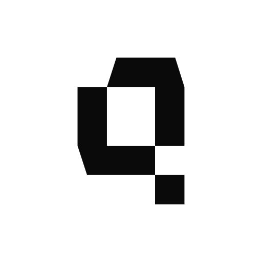
One word, built from square modules. The q ends with a square.
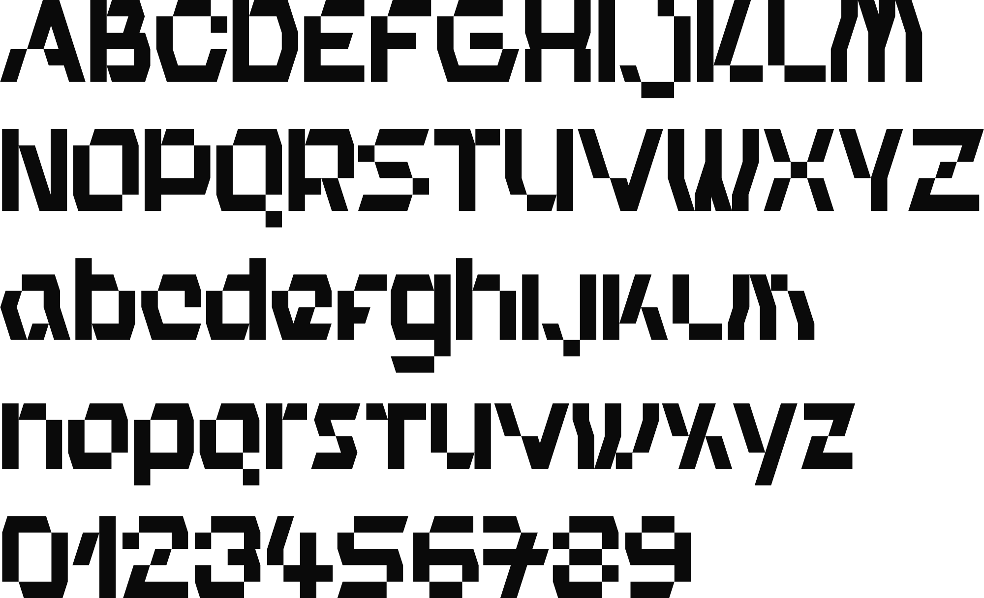
The logo is the word quod in Modulord Regular, in lowercase. We compared four fonts and chose this one. See the four options.
How it is built
One module is the width of every stem, and the square at the end of the q. The word is six modules high. The three spaces between the letters are equal.
Clear space
Keep 2 modules free on every side. Nothing else comes into this space.
Smallest size
60 px wide on a screen, 20 mm in print. Smaller than that, use the icon.
The icon
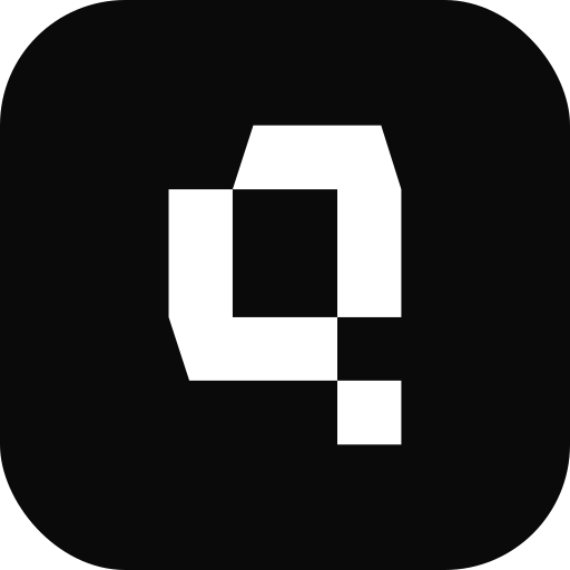
The q alone, in a rounded square. The corner radius is 22% of the side. The q takes 56% of the height.
Colour of the logo
One colour only. Ink on light backgrounds, white on ink or dark.
The logo in motion
The logo builds itself and starts again: a loop of 8 seconds. For a video, a loading screen, and the first second of the product.
1Blocks
Each letter is a plain rectangle.
2The cuts
The counters open row by row. The corners are cut one after another: each one is gone in an instant. Nothing fades, and no cut part is shown.
3The square
The stem of the d grows. Then the corner of the q falls one module and becomes the tail.
Do not
ShowHide
Stretch or squeeze it
Turn it
Fill it with a gradient
Draw it as an outline
Add a shadow or a glow
Change the space between the letters
- quod
Type it in another font
Put it on a busy background
Chapter 6: Colour
Black, white and grey do the work. The colour comes from the characters.
A calm page lets the characters and the product screens stand out. Each character brings one colour, a pale tint and a deep shade. Click a colour to copy its code.
Base
- Ink
#0A0A0AText, the logo, dark buttons - Dark
#161616Dark panels and bands - Grey
#6B6B6BNotes and second lines of text - Heading grey
#7A7A7AThe second half of a heading, 24 px and larger - Line
#E7E7E7Borders and rules (ink at 8%) - Paper
#FAFAFAThe page background - White
#FFFFFFCards and panels
Character colours
Main is the colour of the drawing. Tint is a pale colour for a small tag or an avatar. Deep is for text and icons on the tint. All six sets follow one formula. The panel behind a character is neutral, not tinted.
- BlueDeep on tint
- RedDeep on tint
- PurpleDeep on tint
- Cream
- GreenDeep on tint
- YellowDeep on tint
Two helpers
- Blue for text
#2456D6Key figures on light backgrounds - Character ink
#010303The outlines in the character drawings. Do not change it.
How much of each
A guide for one page or one slide.
- 70%Paper and white
- 15%Ink and dark
- 10%Pale tints
- 5%Character colour
Text on colour
Contrast by the WCAG formula. Text needs 4.5 or more.
- BlueInk text 8.2White 2.4: too low
- RedInk text 6.0White 3.3: too low
- PurpleInk text 7.8White 2.5: too low
- CreamInk text 18.0White 1.1: too low
- GreenInk text 9.8White 2.0: too low
- YellowInk text 15.0White 1.3: too low
- PinkInk text 7.5White 2.6: too low
- InkWhite text 19.8Ink 1.0: too low
- DarkWhite text 18.1Ink 1.1: too low
Text on a character colour is always ink. White text goes on ink and dark only.
Chapter 7: Type
One family, one weight. Size and tone make the order.
Geist sets every text of the brand. Its mono cut sets the small labels. The logo font sets the logo and a few numbers.
- Aa
Geist
Headlines and paragraphs: the site, the deck, documents. Regular only.
Free, SIL Open Font License · by Vercel
- Aa
Geist Mono
Small texts that name things: labels, tags, sources. Never a headline or a paragraph.
Free, SIL Open Font License · by Vercel
Text styles
The styles of the site, with size / line height · letter space. Geist Regular, and Geist Mono for the two label styles.
Ask the company data in plain words
31% 3.8× 1,300
Proactive AI employees that get business tasks done
AI for every team, with the control your company needs
Powerful for pros
One control panel for AI across the company
Each team gets agents for its own repeat work. They work in your systems, with the access each person already has.
Describe a task once. The agent runs it on its own and comes back only when it needs you.
The dashboard shows real usage in our company. Other screens show sample data.
The AI agent platform for teams · Every day at 08:00 · MIT, 2025
Before · Now · Hosting
Rules
- One weightRegular (400) everywhere. Size and tone make the order, not bold.
- Two tonesA heading starts in ink and ends in grey. The ink part holds the statement.
- Tight when largeLetter space goes from 0 at 16 px to −5% at 64 px.
- Sentence caseA capital letter on the first word only.
- Mono stays smallGeist Mono is for labels of 14 px or less. It never sets a headline or a paragraph.
- Short linesRunning text stays at about 70 characters per line, or less.
The logo font
Modulord draws the logo. The site also sets a few numbers in it: the section numbers, the steps and one key figure. Never a word, never a sentence. The plus and the percent sign are not in the font: they are drawn from the same module.
Chapter 8: Pattern
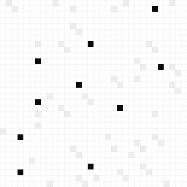
One pattern: Grid. A sheet of small cells.
It comes from the module of the logo. It has four versions: the cells alone, and three versions with a few cells marked.
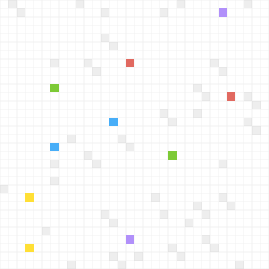
- PlainThe cells alone, with no marked cell. The version for the site, and for any place with numbers or a chart.Tile, SVG
- LightInk cells on white. For print in one colour.Tile, SVG
- ColourThe strong cells take the five character colours. For a cover or a poster.Tile, SVG
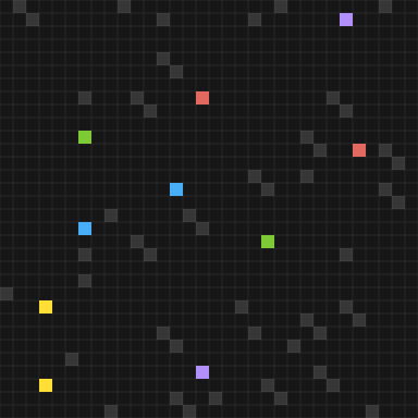
- DarkOn dark panels, with the character colours.Tile, SVG
How it is built
One tile is 32 by 32 cells. It repeats without a seam. For one layout with marked cells, draw one larger sheet, so the eye finds no repeat.
Small cells
A cell is 12 px on a screen and 8 px on a phone. A character in a row is about 14 cells high.
Pale cells
About one cell in twenty is marked, in ink at 7%. On dark: in white at 14%.
Pairs
Two marked cells can touch at a corner, like the q and its tail.
Strong cells
About one cell in a hundred: ink, or the five character colours.
The pattern in motion
The pattern is calm. A few cells move, one at a time. This is for a video, an event screen or a title slide.
- Coming inThe marked cells come in one after another, within 1.2 seconds. The strong cells come last.
- One stepThen one cell at a time moves one cell and later comes back, like the square of the q. About one move in a second.
- Nothing elseThe lines and the other cells are still. For people who ask for less motion, the whole sheet is still.
The pattern at work
On the site the Grid is plain, and it is in one place: behind the rollout chart, like graph paper. No character is on that screen. The cover is a sketch.
Rules
- Never on one screen with the characters. One of the two leads: the pattern or the characters.
- On the site, plain cells only: behind a chart or next to numbers, like graph paper.
- Never behind running text. Text sits on a plain part of the layout.
- No marked cell behind the logo. The thin lines can pass behind it.
- Keep the cells small. Where the logo lies on the Grid, its edges sit on the lines.
- Strong cells are ink, or the five character colours. Do not add colours.
- The pattern ends with a hard edge. It does not fade out.
- Keep it calm. If the pattern is the first thing you see, there is too much of it.
Chapter 9: The characters
Why an AI platform has monsters
A fair question from a serious client. The answer has three parts.
A face for the agent
An agent is hard to picture. A face turns it into a colleague you can name. We are used to working with living beings, so this is easier to think about.
One role, one character
Agents work best when each does one job well, like people on a team. So each character takes the work of one team.
A counterweight to the serious part
AI for work is exact and technical. Soft, hand-drawn characters make the work feel lighter, and the product easier to come into.
And the short answer: we like them.
The cast
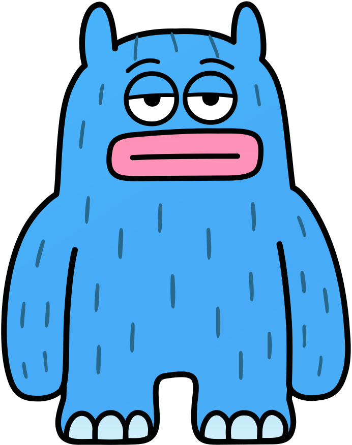
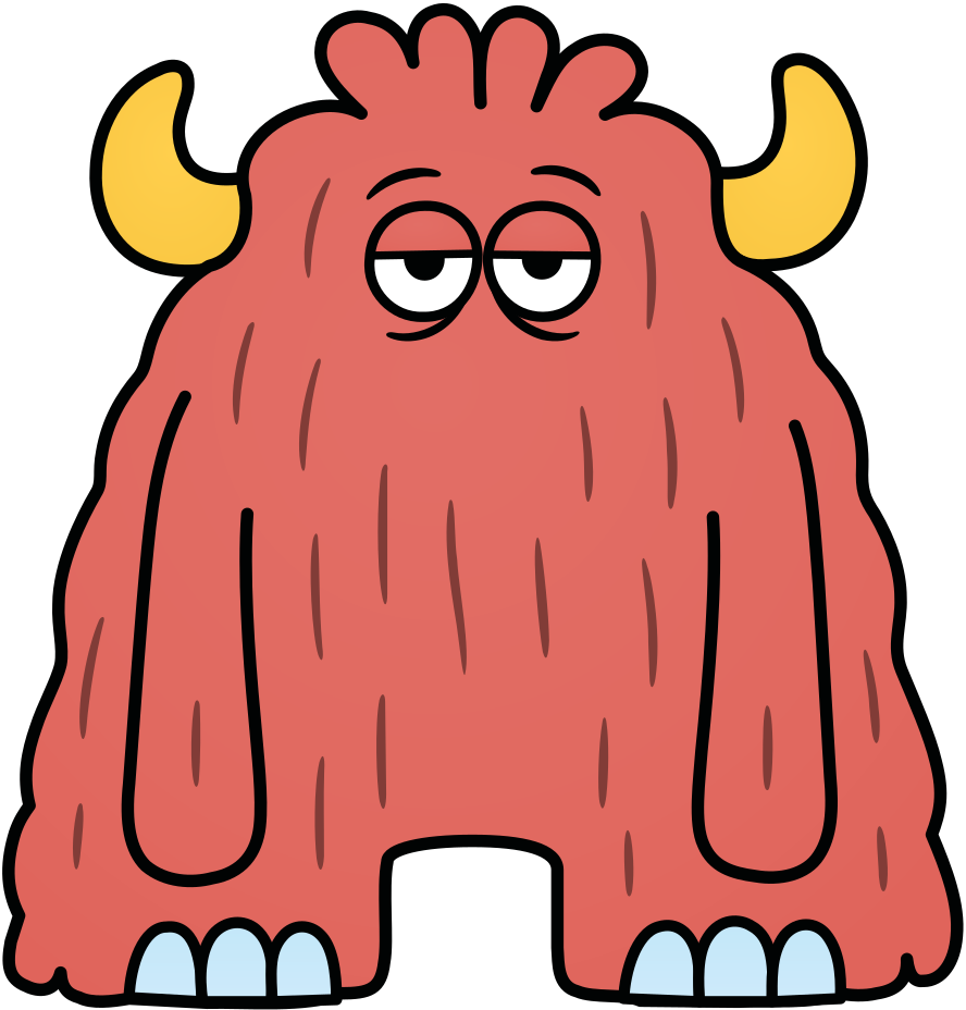
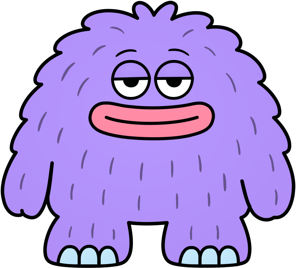
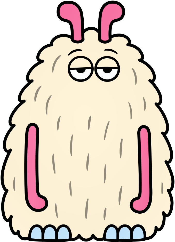
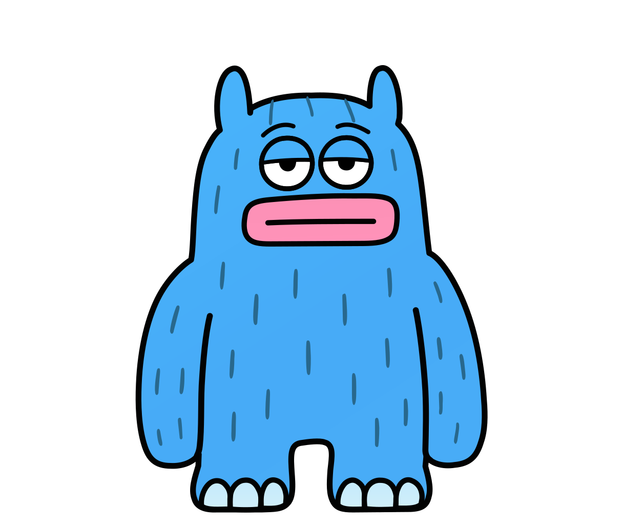
Six vector drawings, each clean and with its own prop. Blue is the main agent: it takes any task. Each of the others does the work of one team.
- Main agent
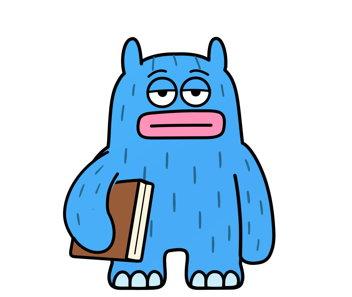
Blue
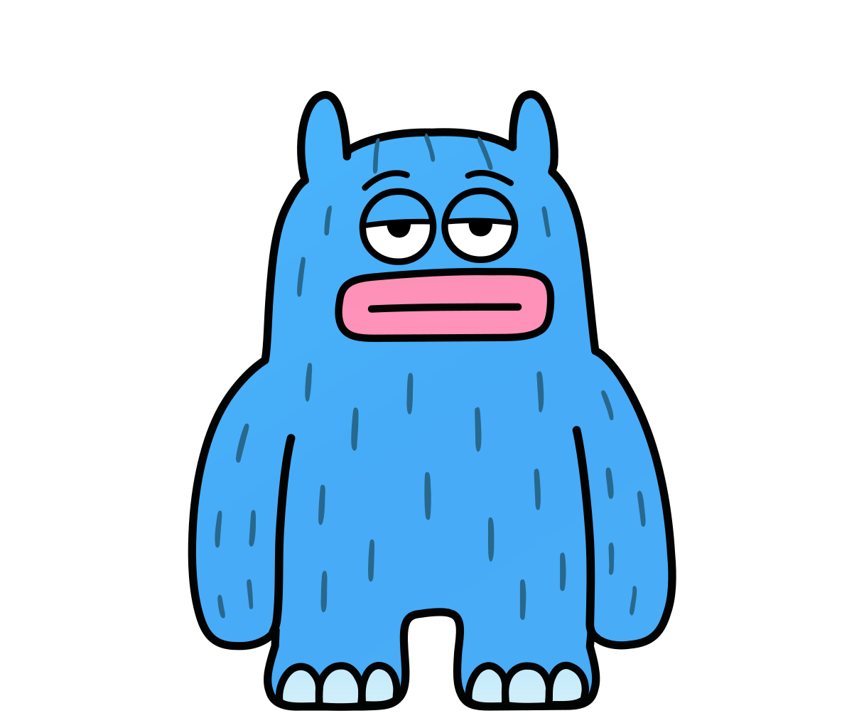
Two horns and pink lips. Prop: a book.
“Takes any task, and brings in the right agent.”
- Finance
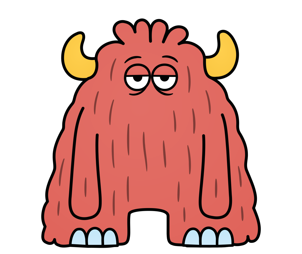
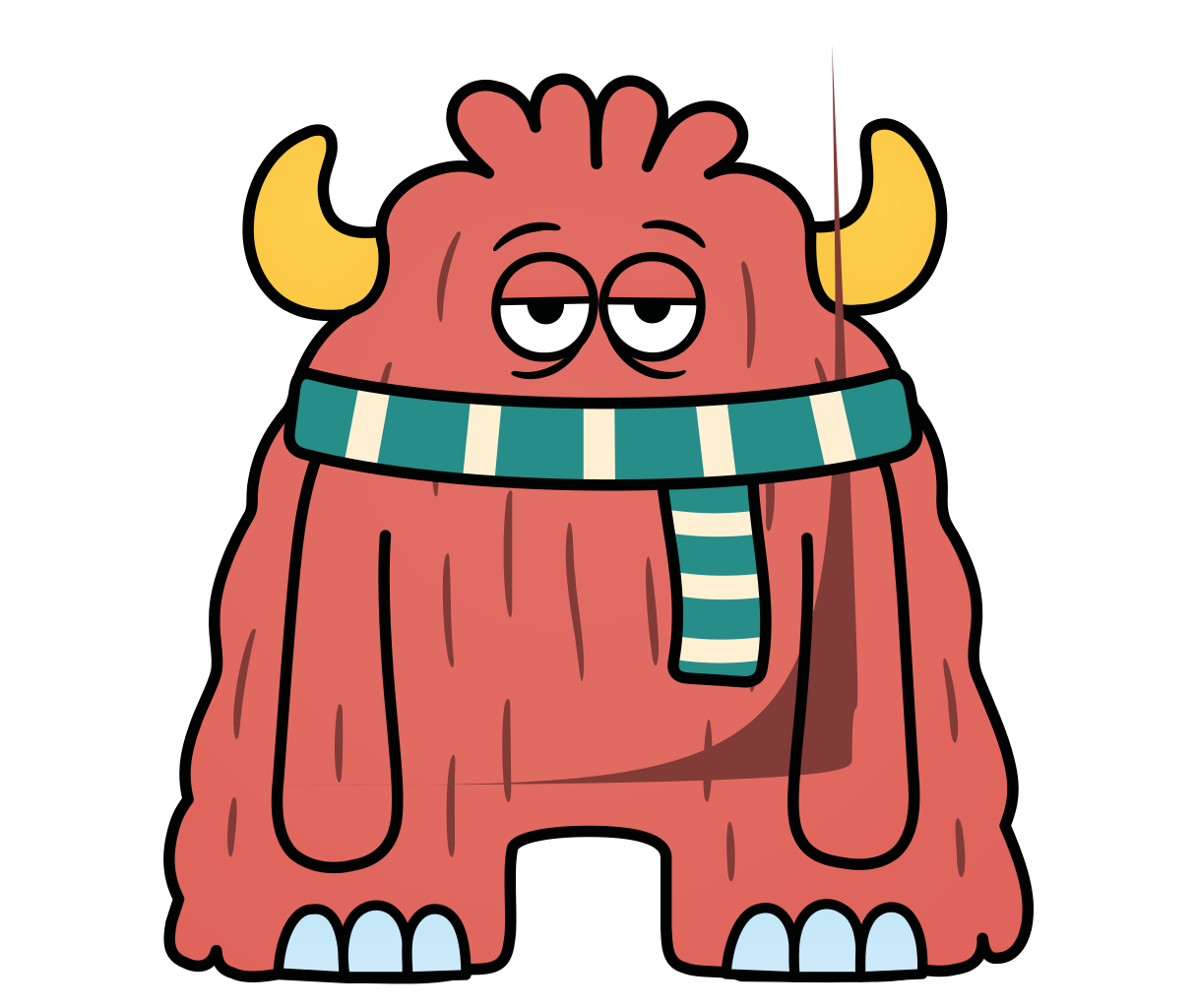
Red
Yellow horns and long arms. Prop: a scarf.
“Keeps a cool head at month end.”
- Support
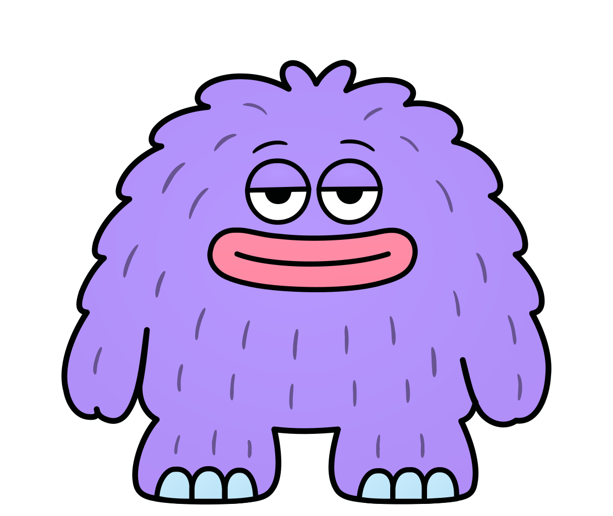
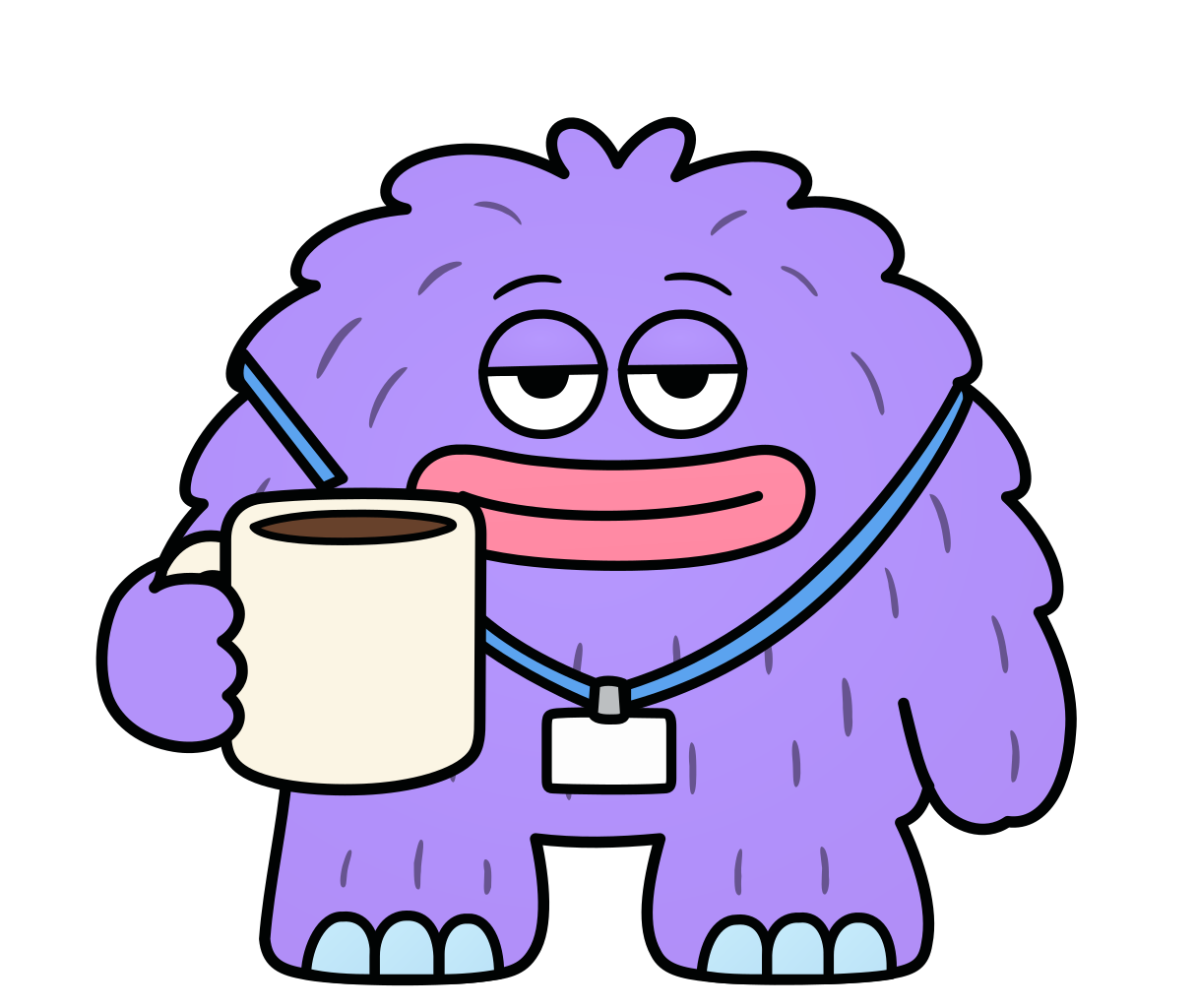
Purple
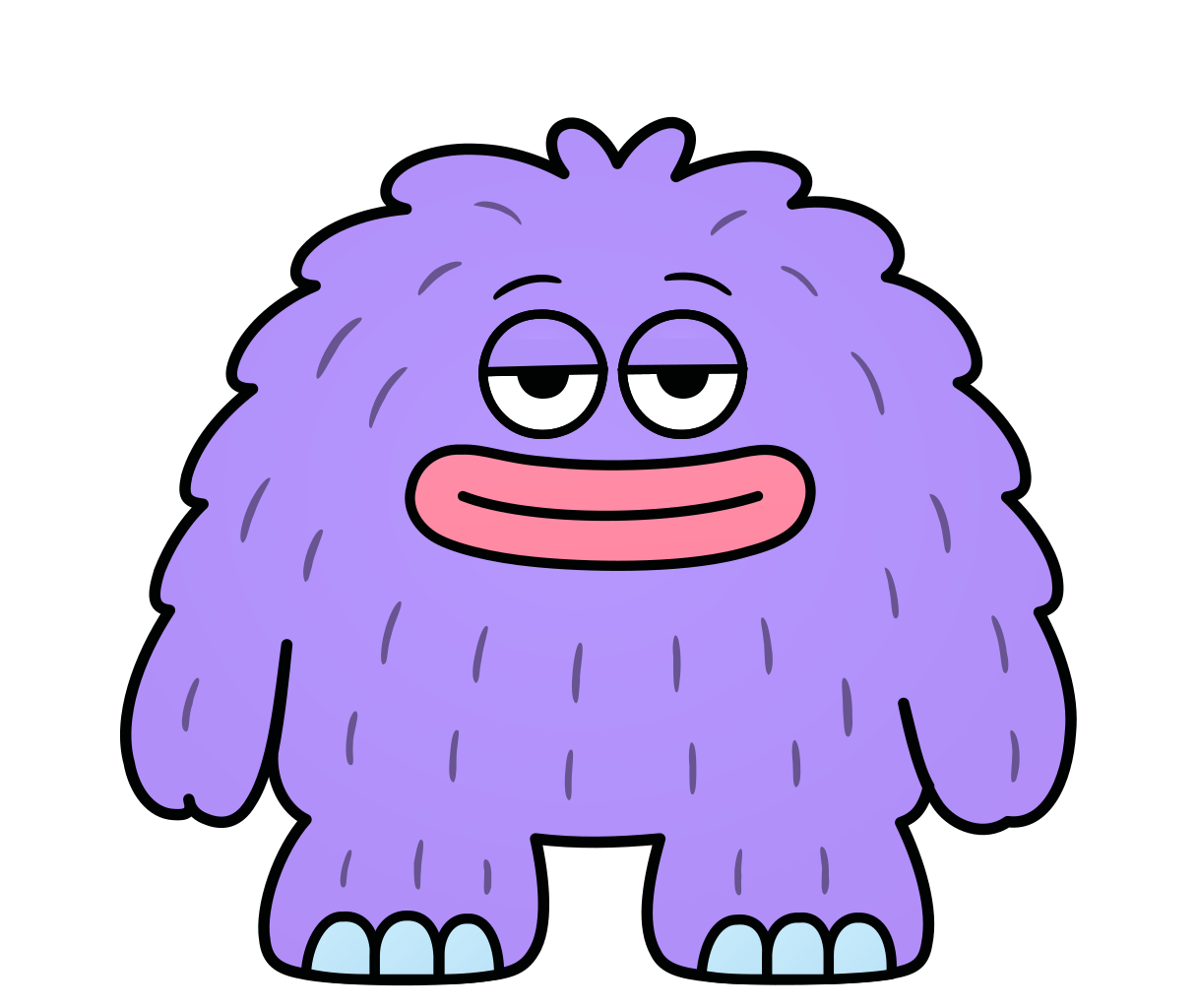
Round and fluffy. Prop: a mug.
“Knows the answer, or where to find it.”
- Marketing
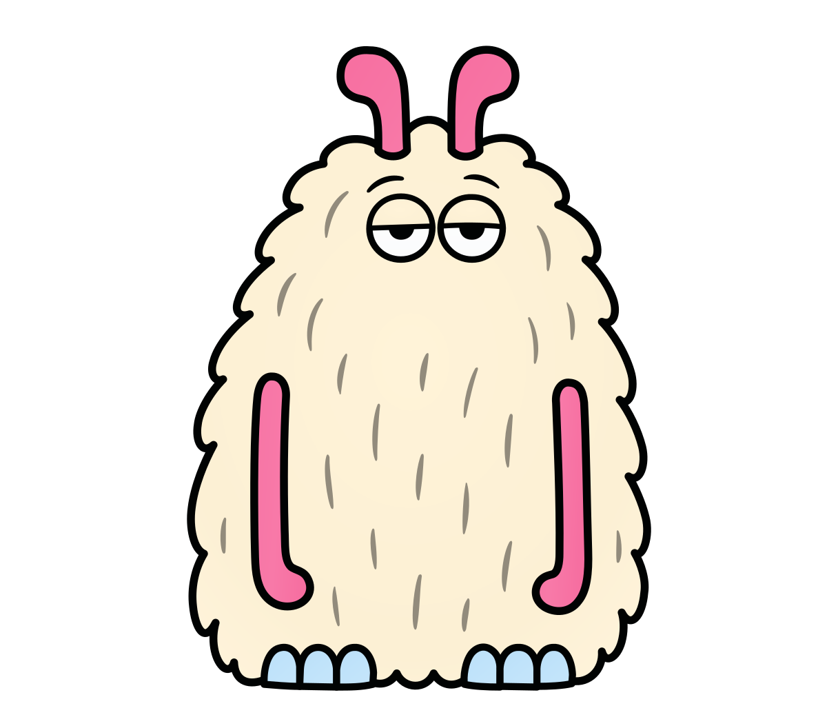
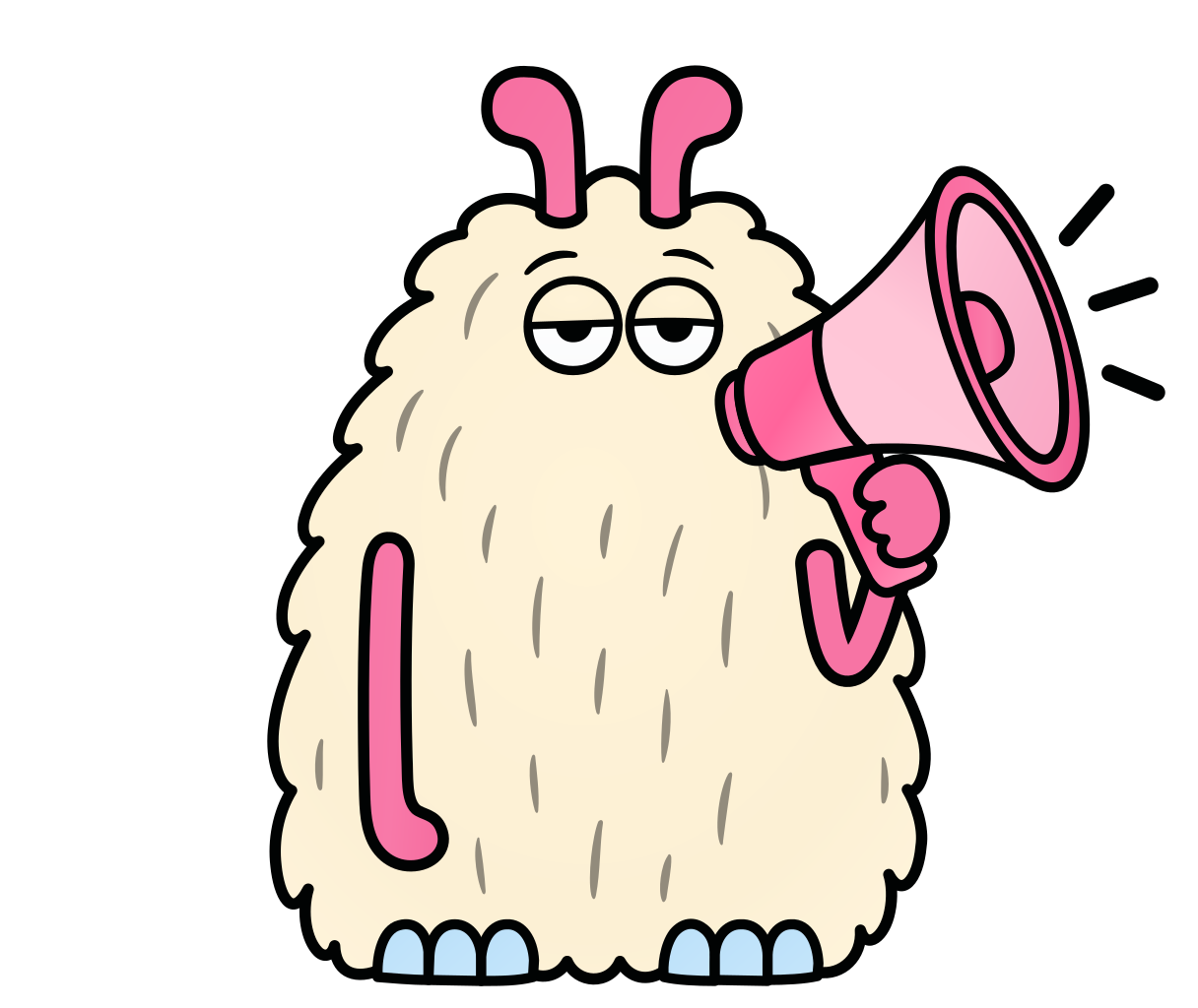
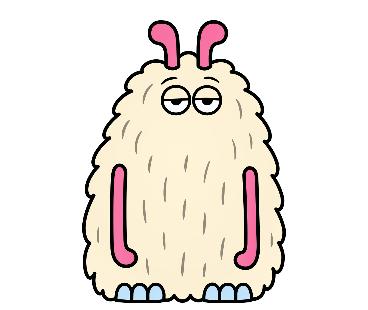
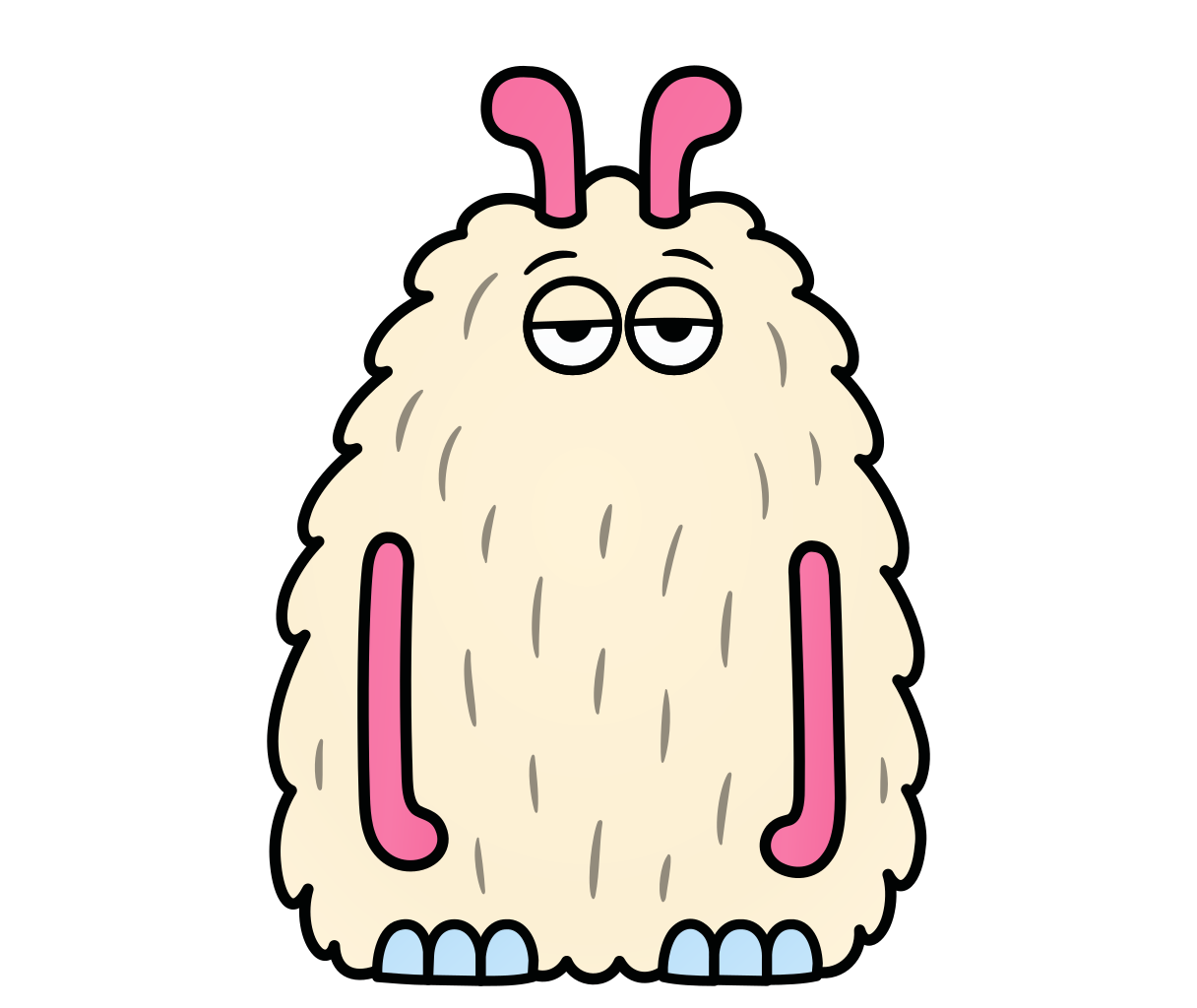
Cream
Pink antennae and pink arms. Prop: a megaphone.
“Tells everyone what is new.”
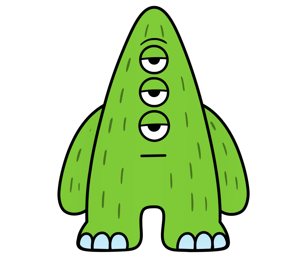
- Operations
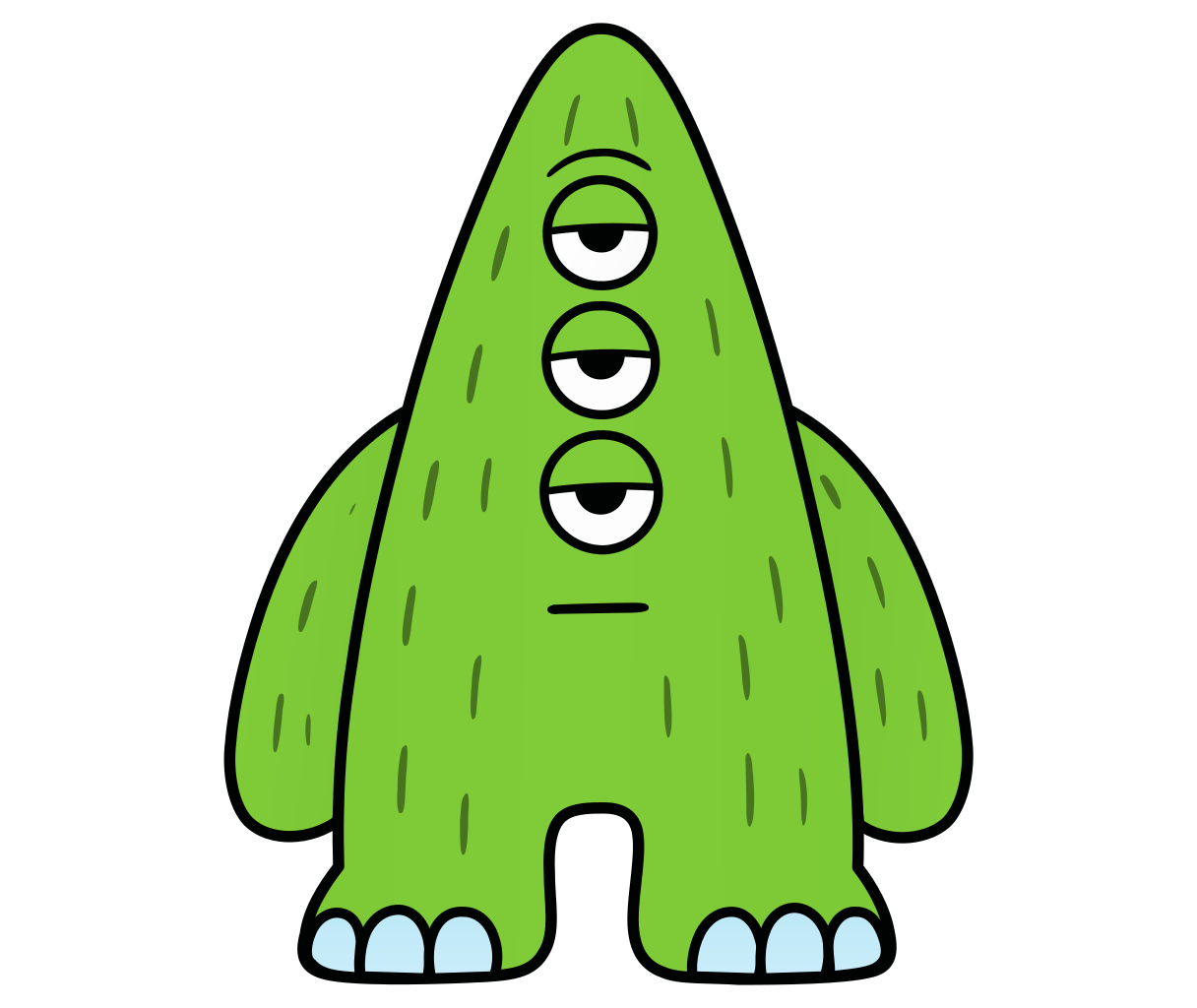
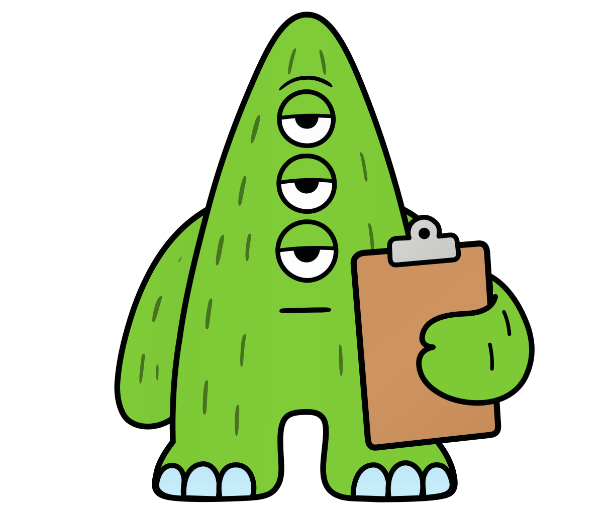
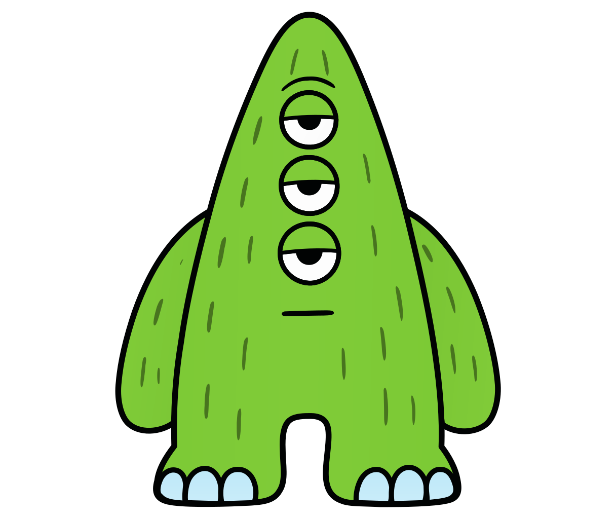
Green
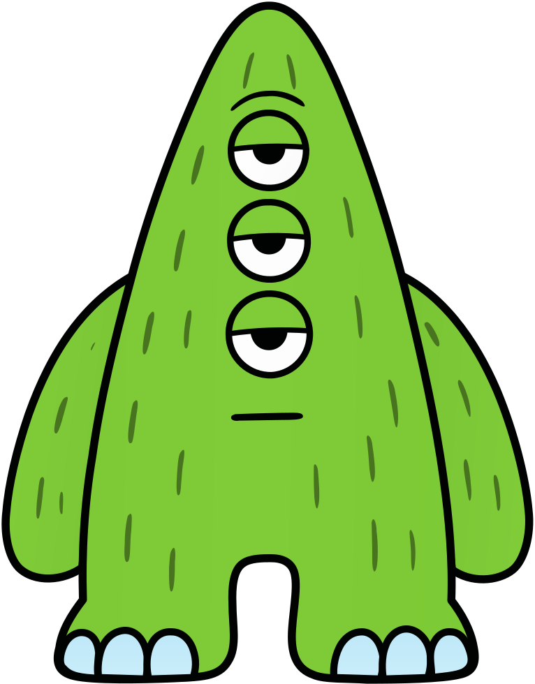
Three eyes. Prop: a clipboard.
“Three eyes on every checklist.”
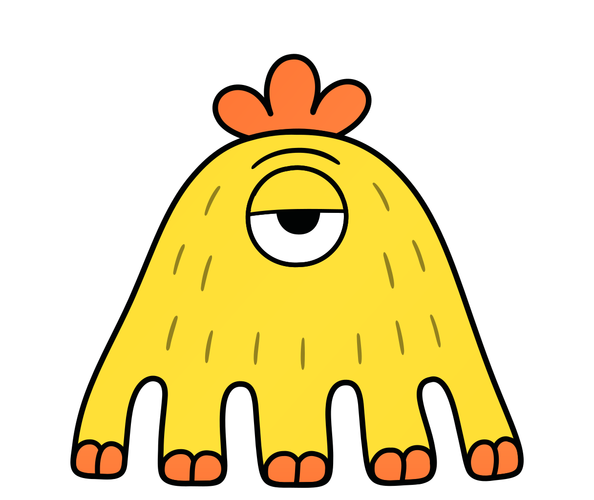
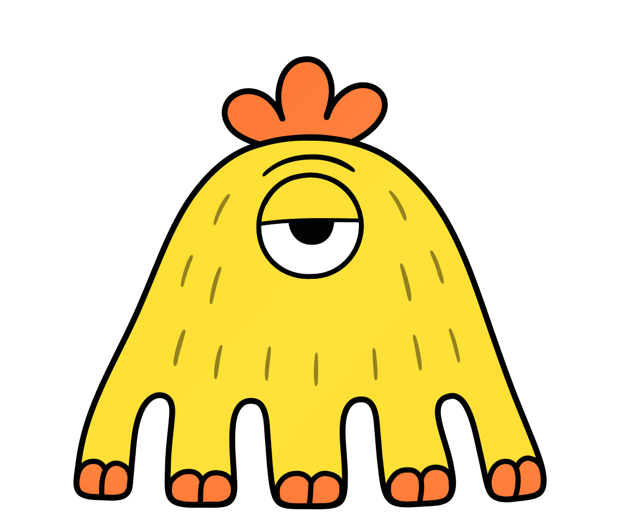
- Analytics
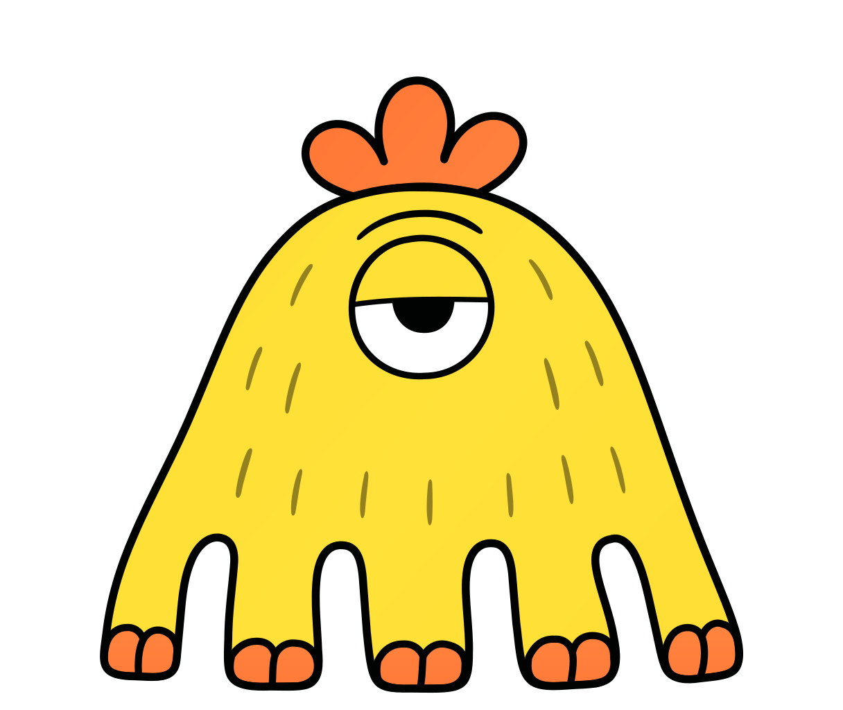
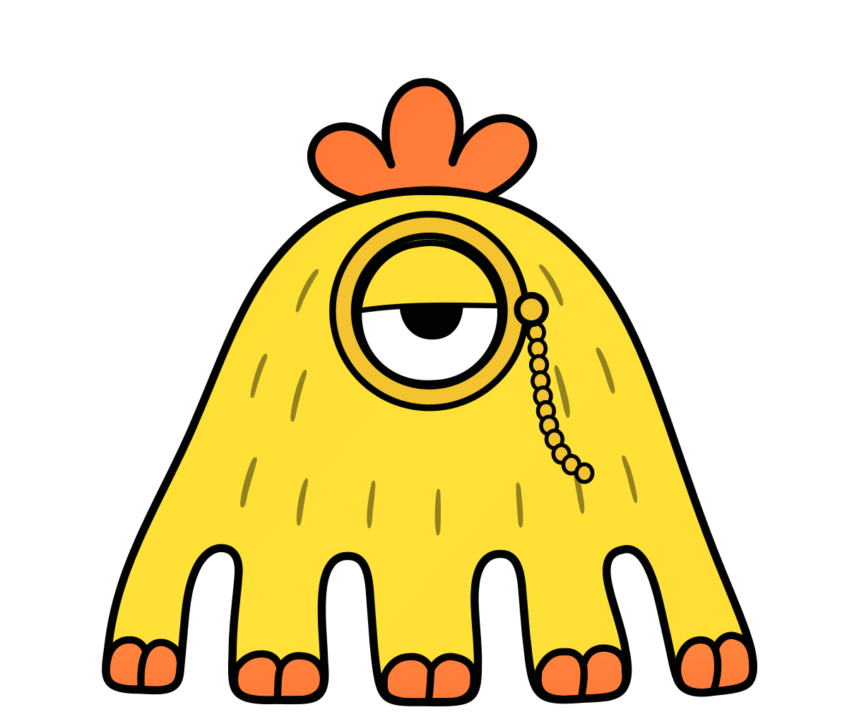
Yellow
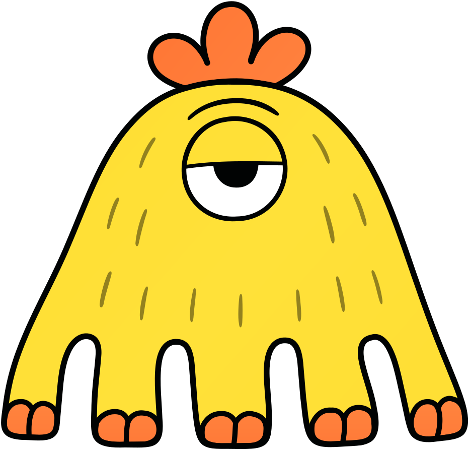
One eye and five legs. Prop: a monocle.
“Looks at the numbers until they add up.”
They blink, and they smile
Each character has a drawing that lives. Most of the time it stands still. It blinks: a lid slides down over the eye and comes back, in less than a fifth of a second. From time to time it smiles for about three seconds. In a group the smile goes from one character to the next: two of them never start together. It is one SVG file, so it works as a plain picture too.
The smile
A calm smile, not a wide one. Only the mouth changes: the eyes, the lids and the brows stay as they are at rest. Blue, Purple and Green have a mouth: it curves. Red, Cream and Yellow have no mouth at rest: the smile is one short curved line. Each character has a still drawing with the smile.
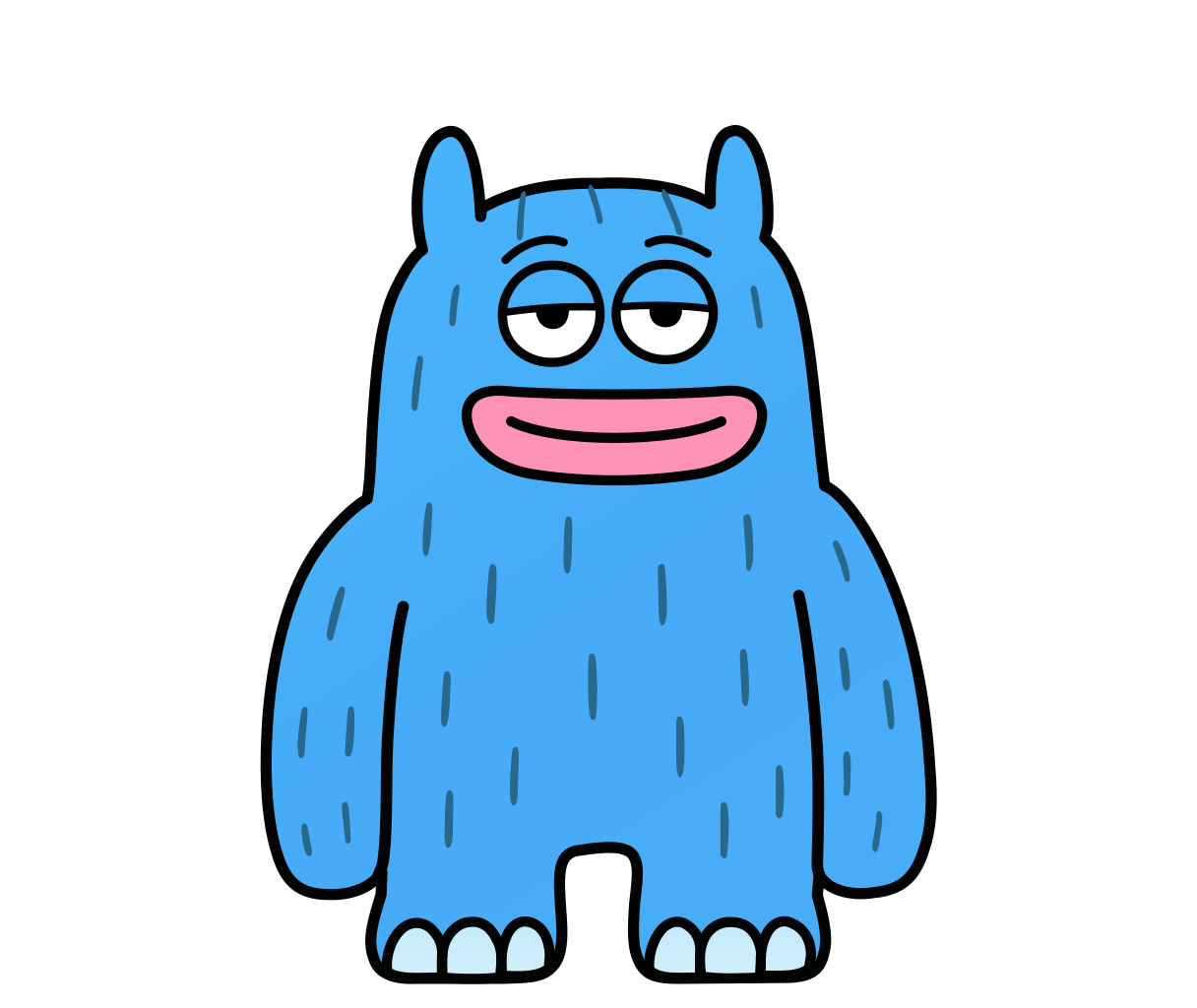 BlueAt rest · Smile
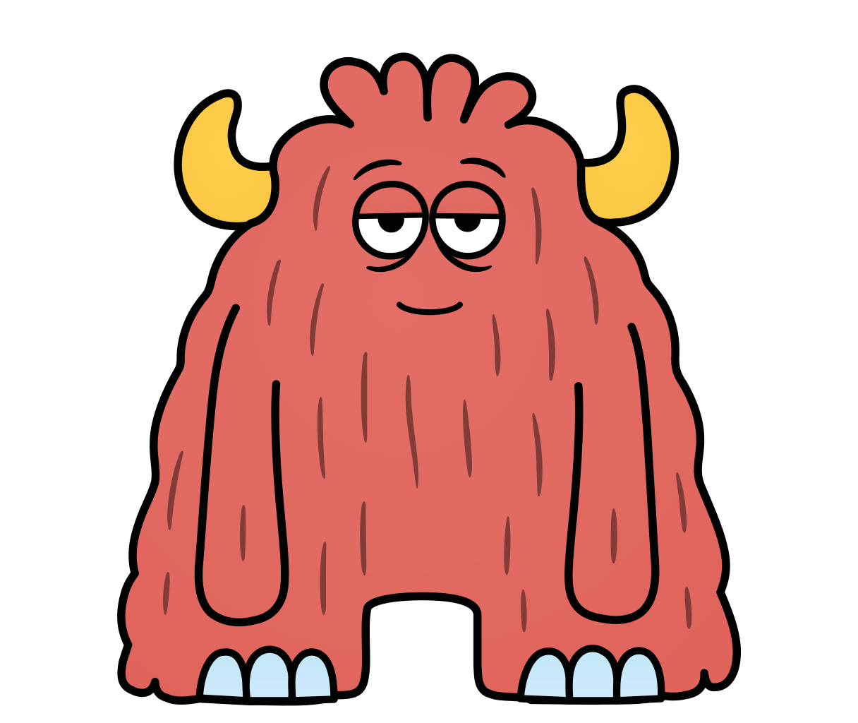 RedAt rest · Smile
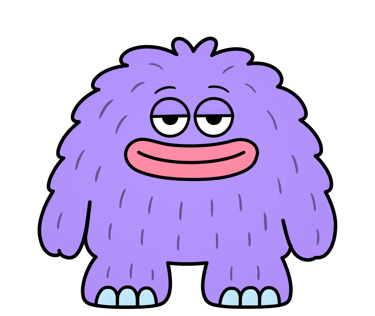 PurpleAt rest · Smile
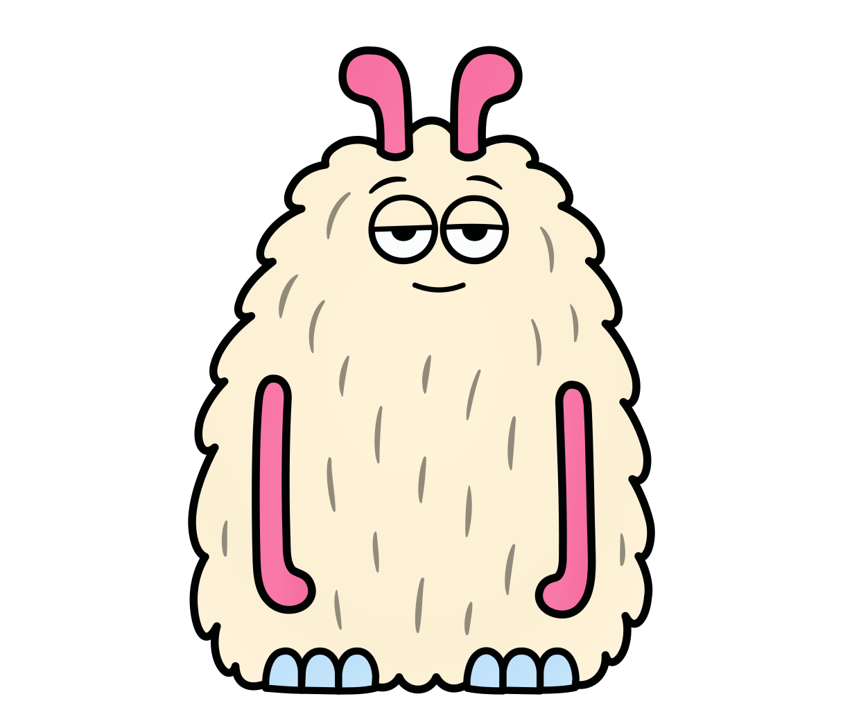 CreamAt rest · Smile
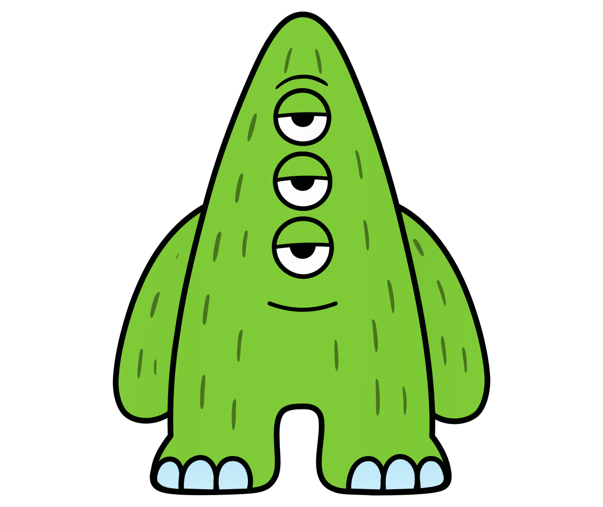 GreenAt rest · Smile
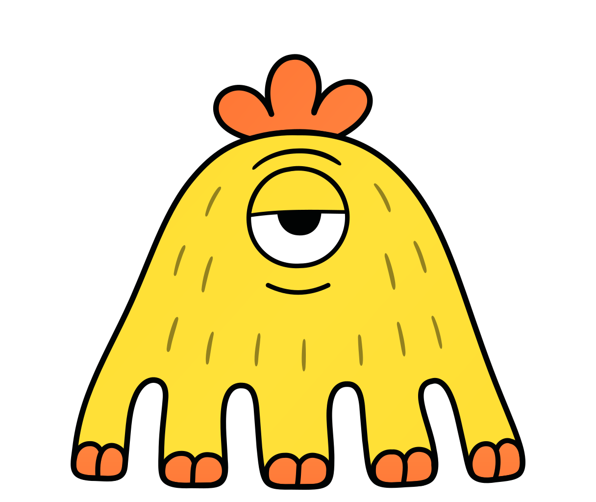 YellowAt rest · Smile
One scale, one ground line
All six share one canvas of 1216 × 1024 px. The feet stand on the same line, so any two characters fit side by side.
One line style
Line widths on the 1024 px canvas. One ink colour, flat fills.
- Outline
- 12 px
- Parts
- 11 px
- Eyes
- 10 px
- Brows and fur
- 9 px
- Eyelids
- 8 px
Fur lines take a darker shade of the body colour. Pupils are solid, with no highlight.
How to use them
- They stand on one ground line, at the scale they were drawn.
- In a group they stand close: each one a little over the next, and not by the same amount.
- A prop stays in front of the next character.
- Each keeps its colour. The panel behind it is neutral: the character is the colour.
- Flat colour and one ink line. No shadows, no gradients, no glow.
- In the base pose the eyes are half closed: calm, never scared or angry.
- The smile is small and calm, and only the mouth changes. It comes and goes. It is not the base pose.
- Never on the Grid pattern. The pattern and the characters do not share one screen.
- Do not stretch, recolour, rotate or crop them. The one crop we use is a portrait from the chest up.
- For a small round avatar, use the avatar drawing. Do not cut one from the large drawing.
As an avatar
For small sizes each character has its own avatar: a special small drawing of the face alone, on the body colour. All faces have one eye size, so a list of agents looks even. The one large eye of Yellow keeps its size.
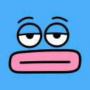 Blue
 Red
 Purple
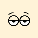 Cream
 Green
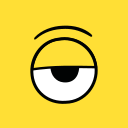 Yellow
Chapter 10: Icons and images
Even lines, soft panels, real product screens
What stands next to the logo and the characters: icons, the panels behind product screens, and the rules for pictures.
Icons
The brand icons come from Iconoteka: 1,400 icons in seven weights, free under the MIT licence. Their even lines and straight cuts sit well next to the logo.
- One weightRegular, in the stroke style. Iconoteka has seven weights; we use one.
- One colourInk, or the deep shade on a pale square of the same colour.
- 24 px gridUse 20 to 24 px. Do not use an icon smaller than 16 px.
Iconoteka is made by Oleg Turbaba: iconoteka.com. Copies of product screens keep the icons of the product.
Panels
Soft gradients with a fine grain: a product screen always stands on one of them. Two flat panels: dark for key numbers, neutral behind a character. On slides the gradients are much paler.
- Blue grainThe main panel behind a product screen
- Dark grainDark bands behind product screens
- Sky to lilacA second panel in a pair
- Steel to blueA second panel in a pair
- Flat darkKey numbers and the last call
- NeutralBehind a character and the work of its team
Corners
One scale of corners for the site, this book and the copies of product screens. The role of a block gives its radius, not its size. The values are the same on a phone.
- Panel · 24 pxA panel or a card on the page, and the header
- Block · 16 pxA block inside a panel, a small tile, a low strip
- Tile · 12 pxAn icon tile, a field, a card inside a product screen
- SupportTag · 8 pxA tag, a tooltip, a menu item
- Book a callPillButtons, chips and thin bars
- CircleAvatars and round buttons
A block that is 8 px inside a panel has 16 px, so the two corners have one centre. The app icon has its own rule: 22% of the side.
Product screens
- Show the real product, as a window on a panel.
- Sample data on every screen, except our own usage numbers.
- Say it under the screen: “Product screens on this page show sample data.”
Pictures
- No stock photos. The characters and the product screens carry the page.
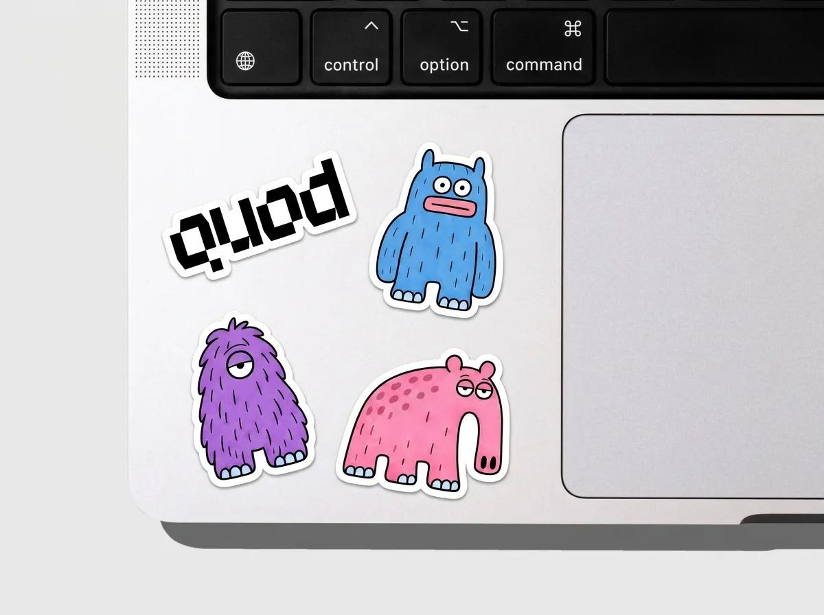
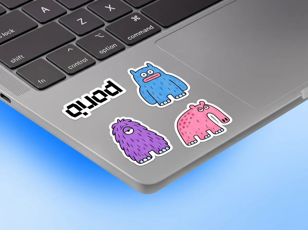
- AI images are for mockups only: a laptop, a badge, a bag. Mark each one “AI image”.
- Check every AI image against the original logo and the original characters before you use it.
Chapter 11: In use
On the site today, and on things we have not made yet
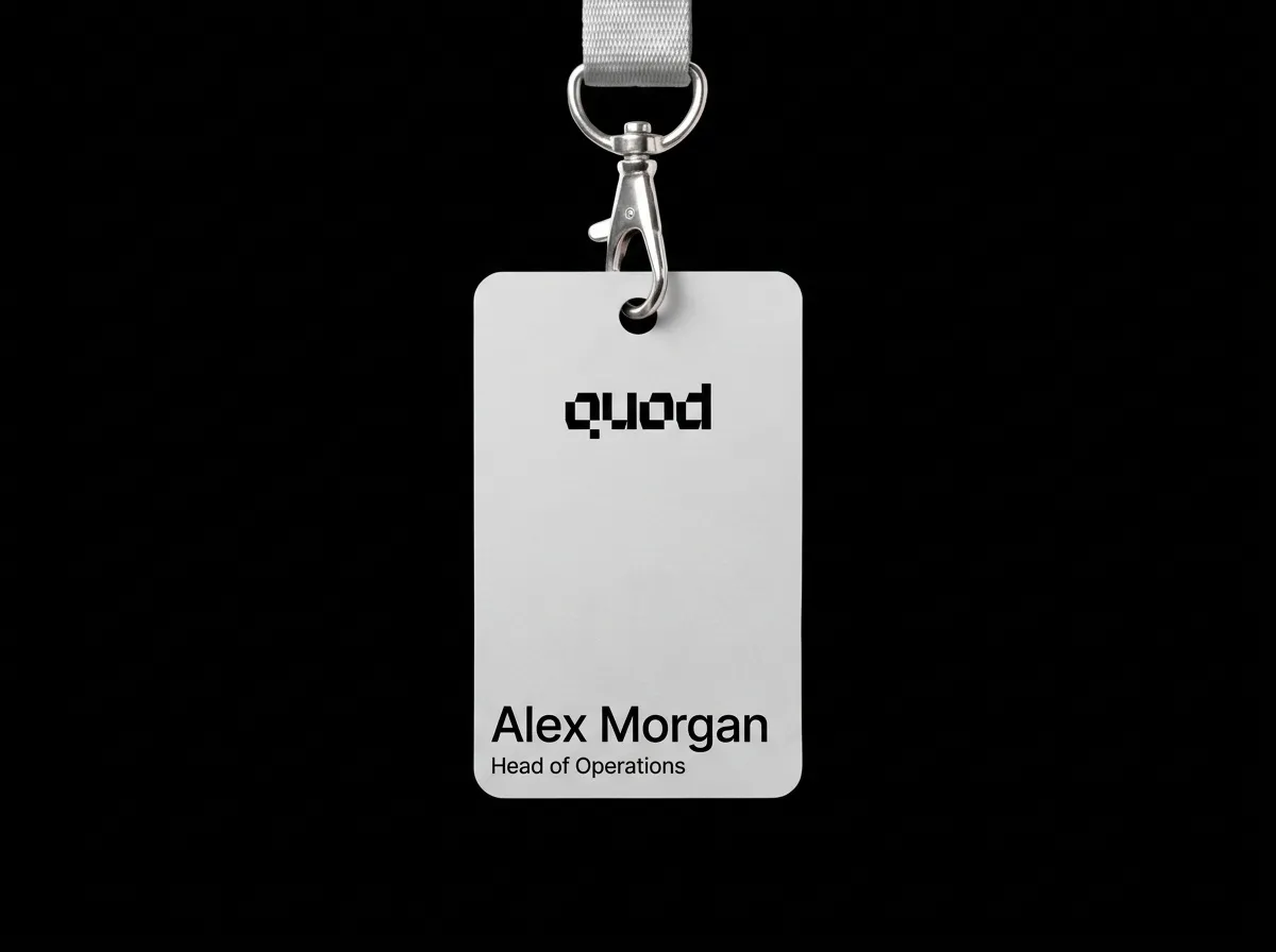
The site follows this book: the logo, the characters and the icons. The business card and the poster are sketches. The laptop and the badge are AI images, and they still show three older drawings.


getquod.ai
Chapter 12: Slides
Slides come from one template, and a skill makes them
A deck in the Quod look is one HTML file with 16 layouts. A skill for Claude writes it. The deck opens in a browser, works as a Claude artifact, and prints to PDF.
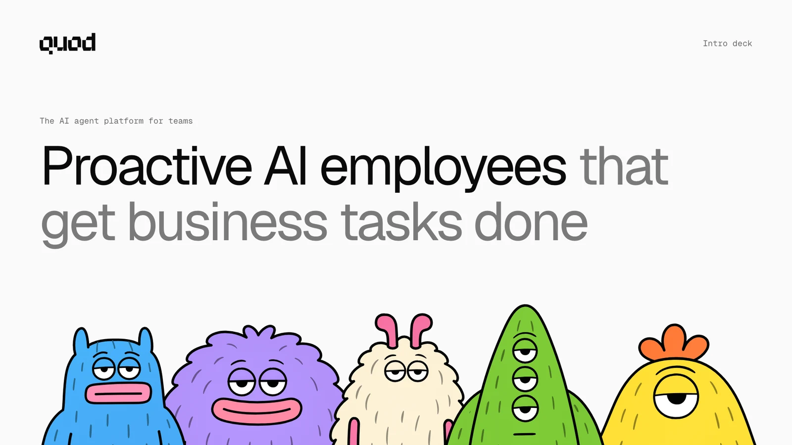 TitleThe logo, the title, five characters from the chest up
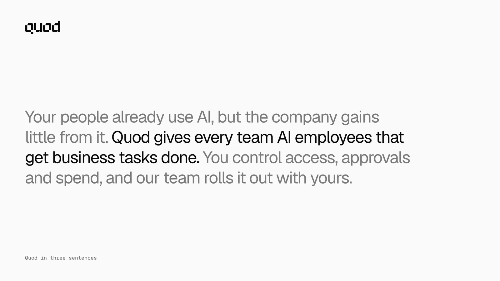 SummaryThe deck in three sentences. One of them is ink
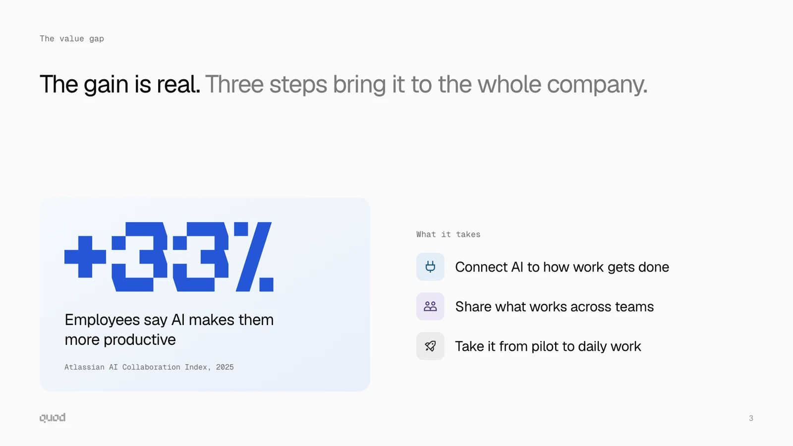 Key figureOne figure in the logo font, on a pale panel
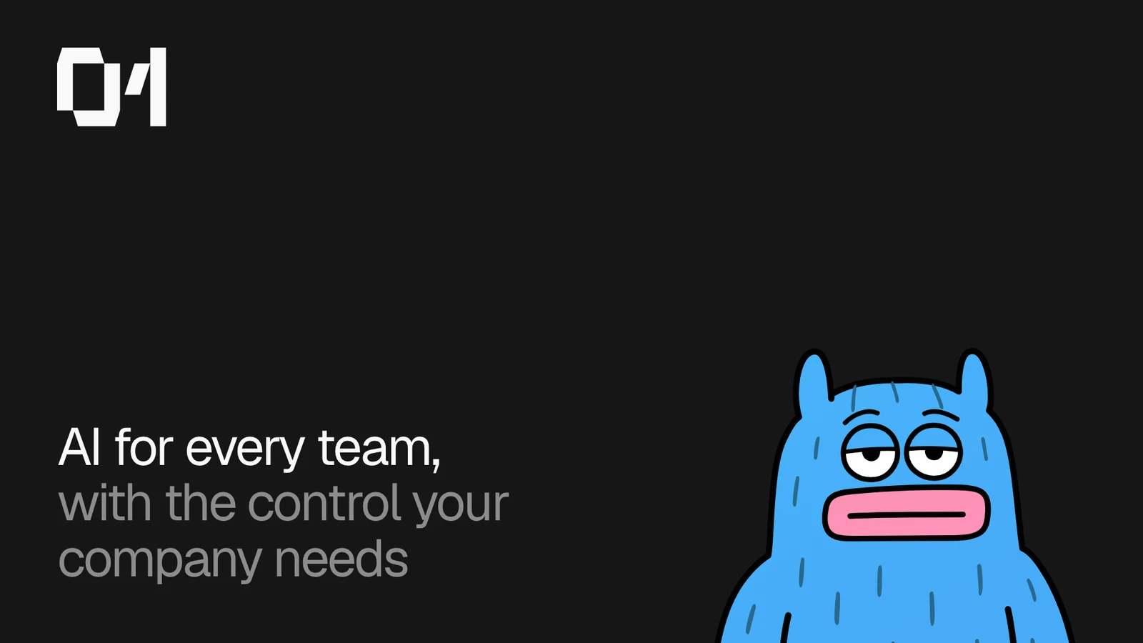 SectionDark. The number of the part, one character from the chest up
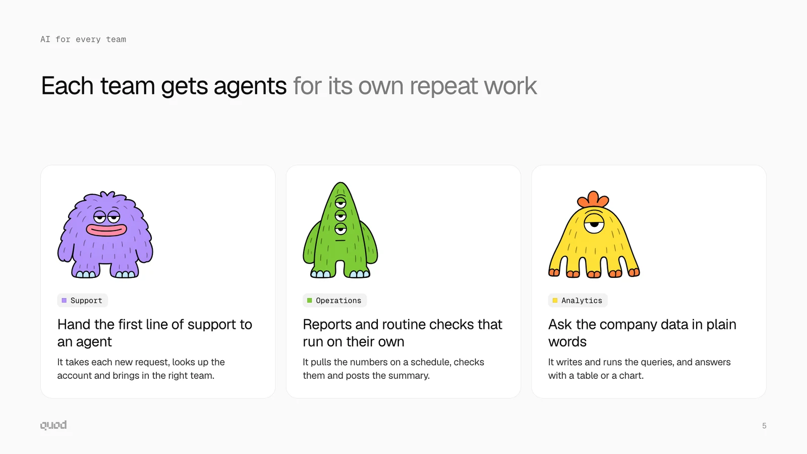 AgentsThree characters, each on a white card
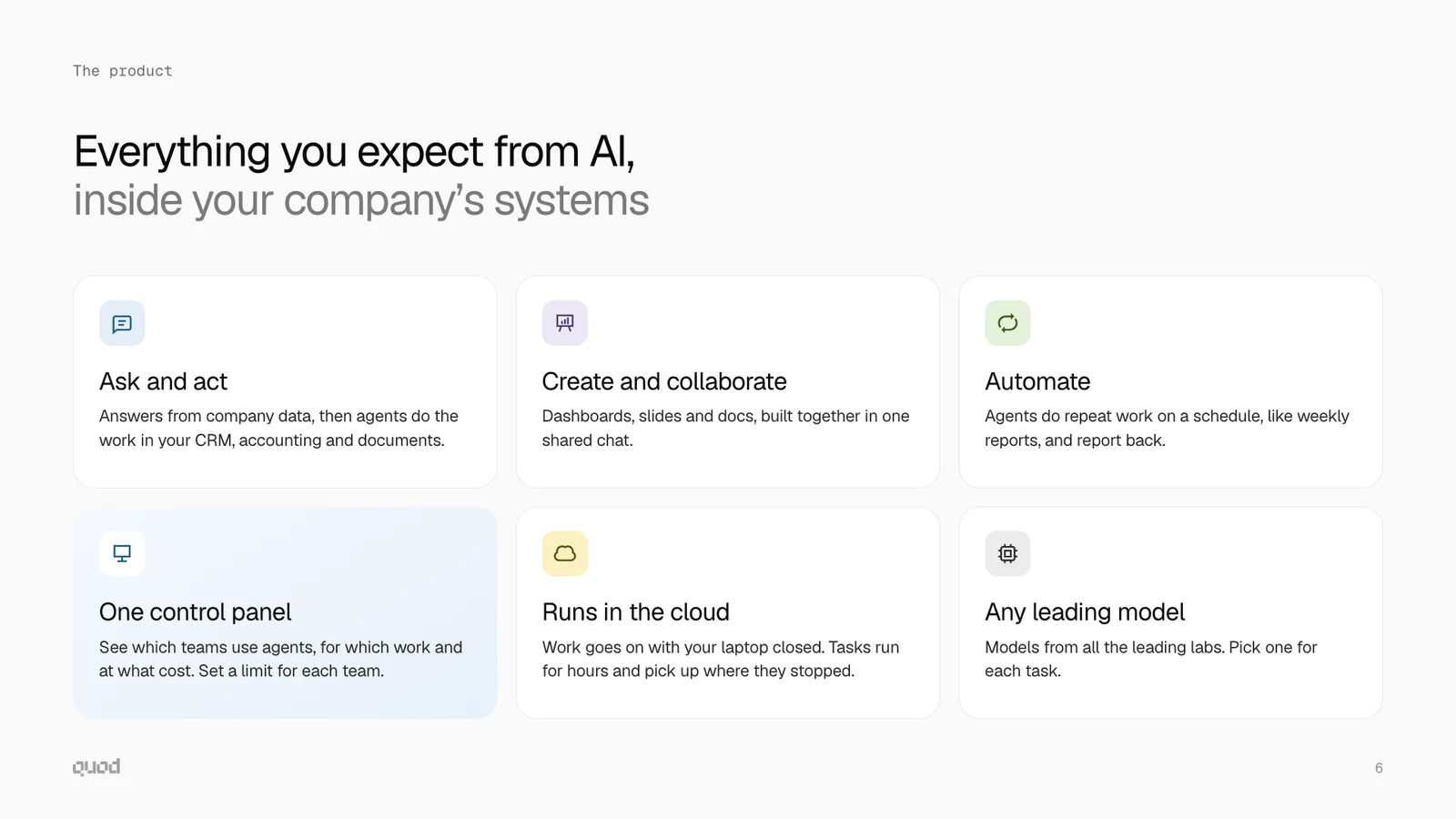 CardsThree to six cards. One card has the main point
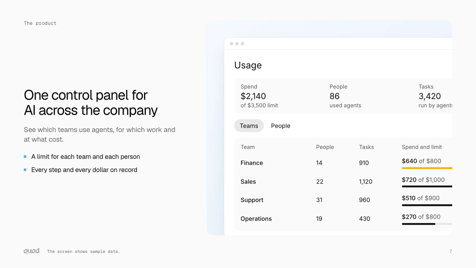 Product screenA real screen on a pale panel
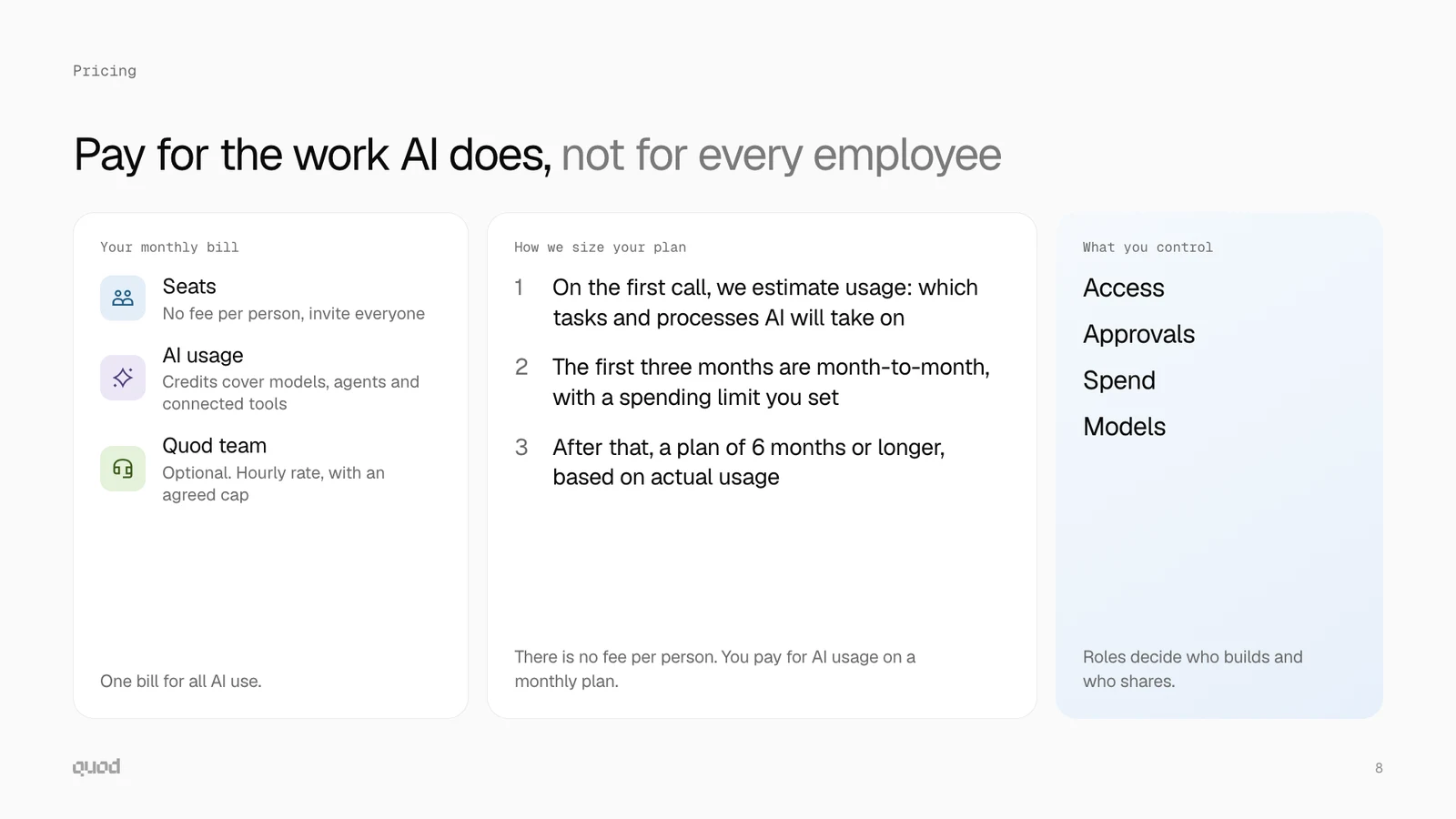 ListsCards with a label and a list: icons, steps or plain words
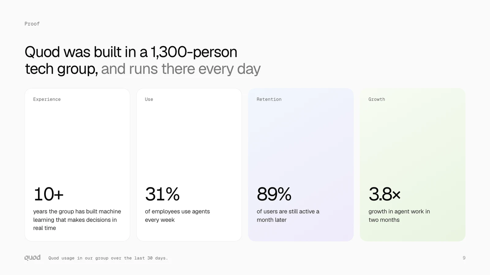 NumbersTall cards: a label at the top, a number at the bottom
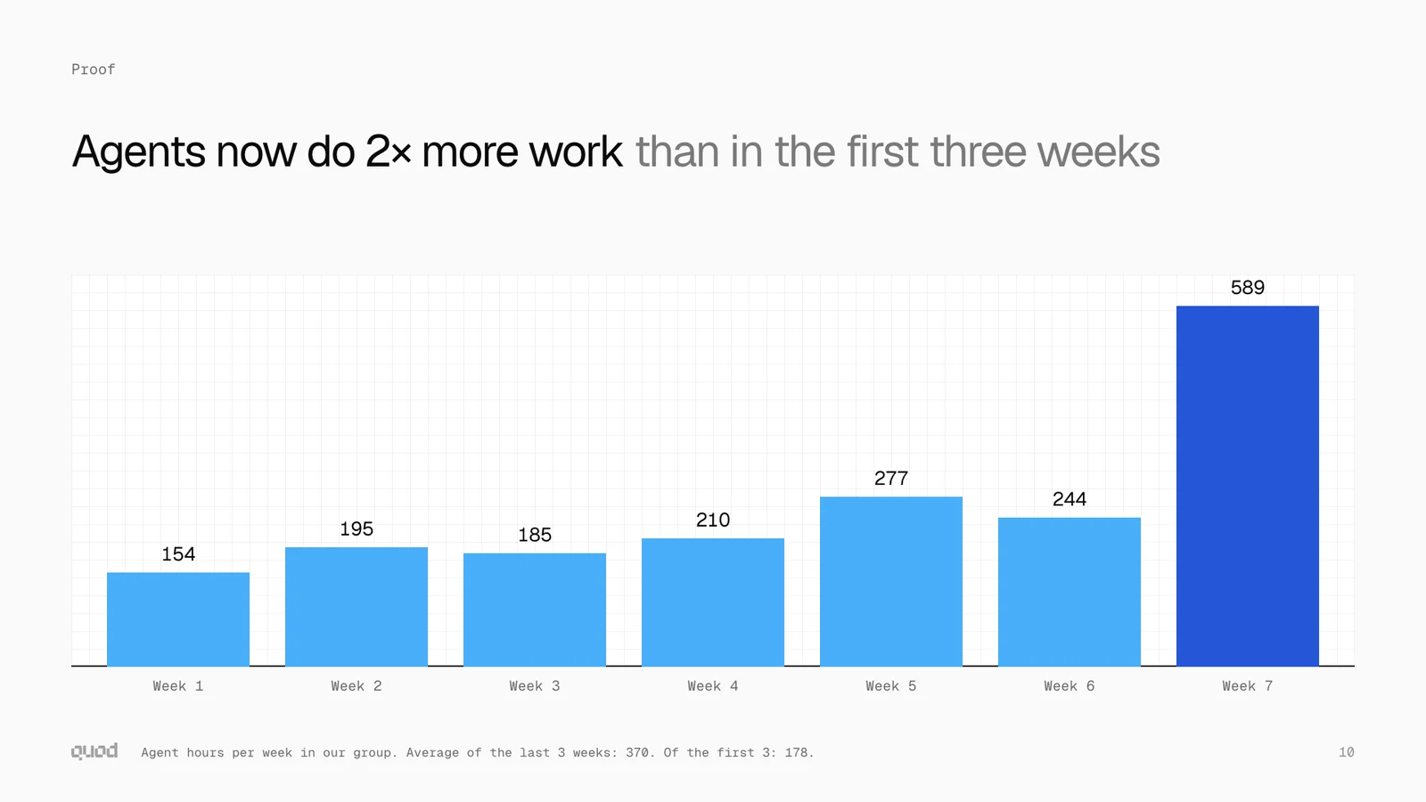 ChartBars on plain cells: the one place for the pattern
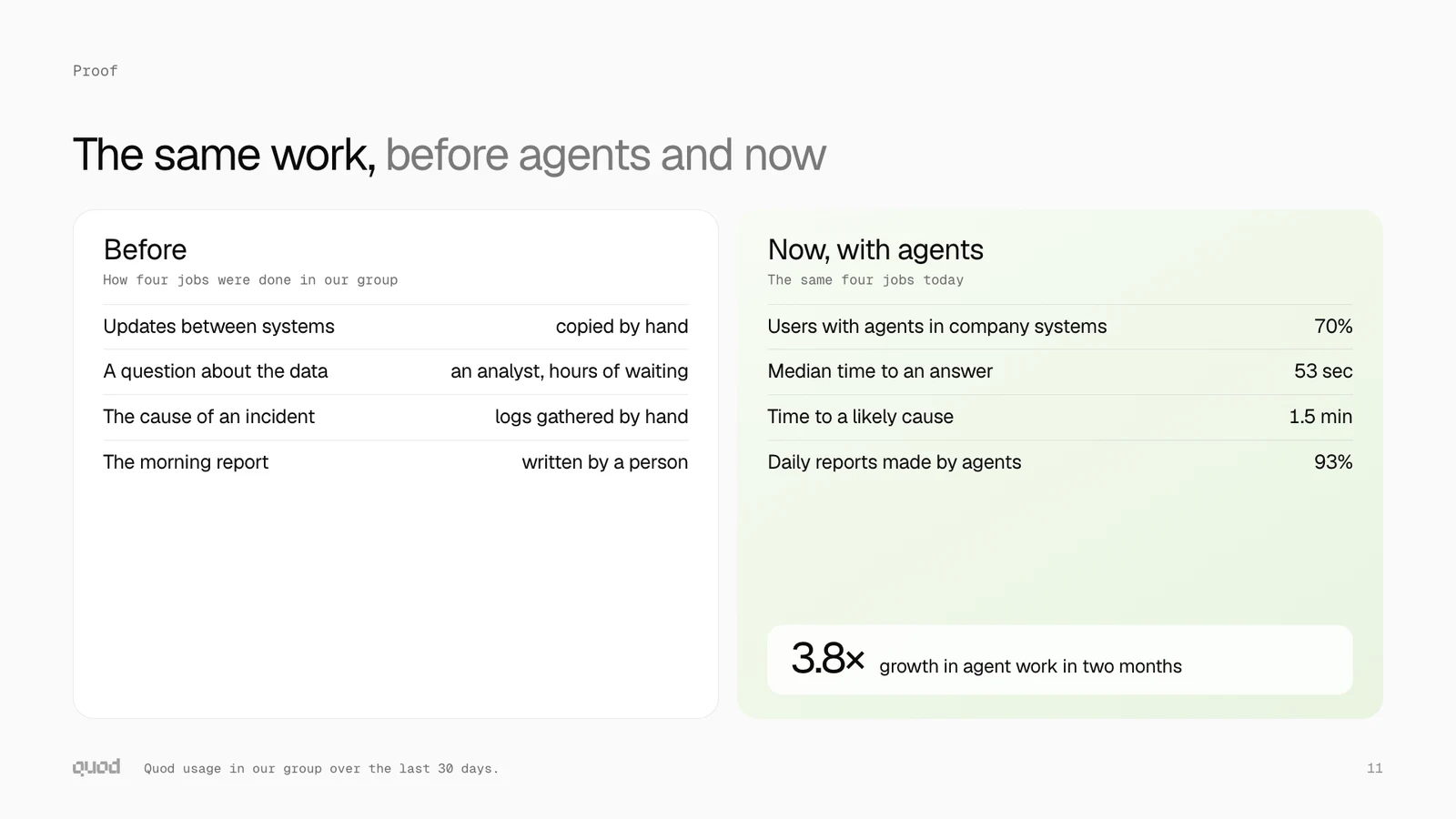 LedgerTwo cards with rows of a name and a value
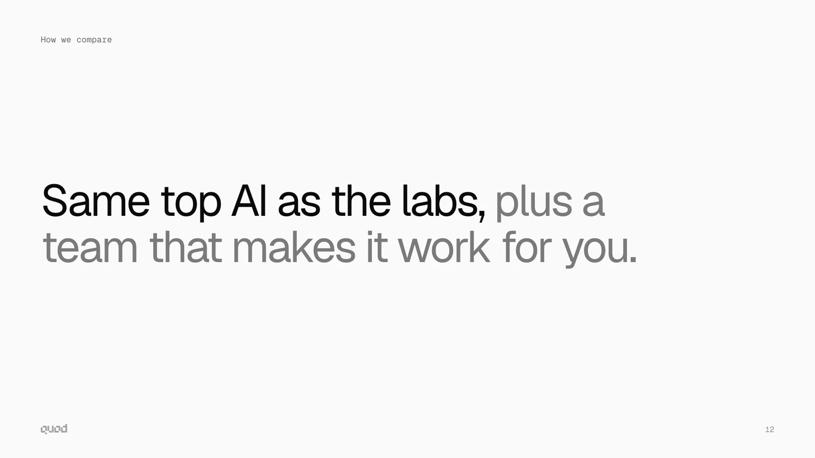 StatementOne sentence, large
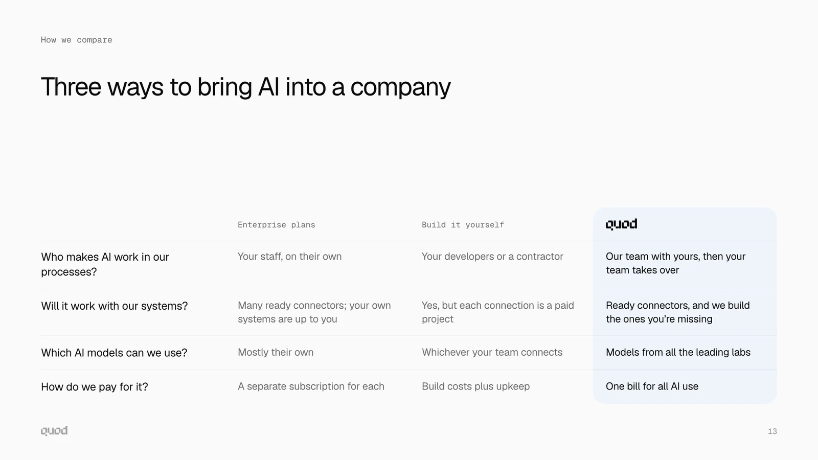 ComparisonA table. The last column is Quod
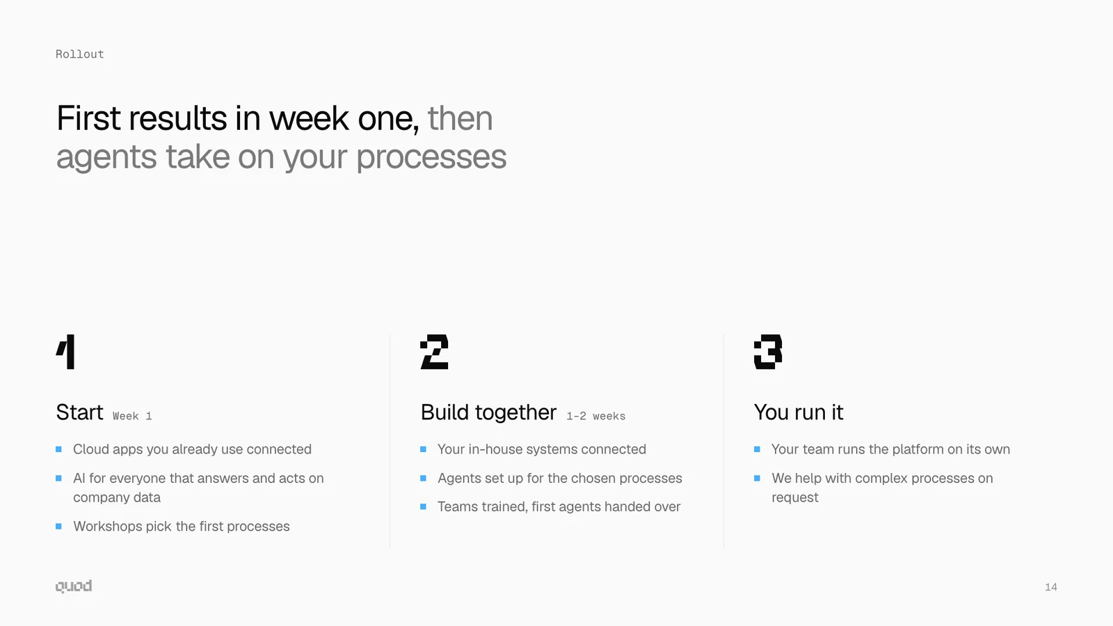 StepsThree steps in order
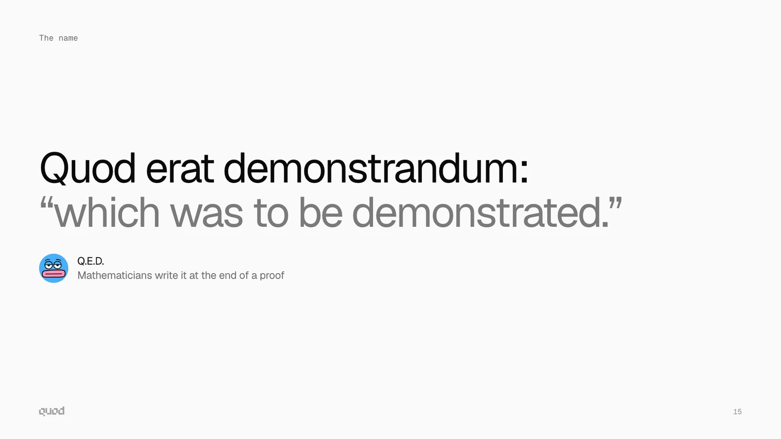 QuoteReal words, or a line from the brand
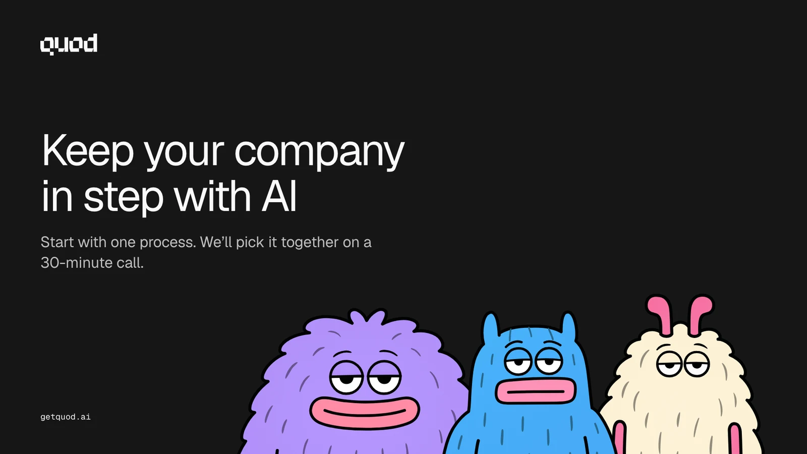 CloseDark. The next step, and three characters from the chest up
Download the skillOpen the sample deck
The look of a slide
A slide is calmer than the site: paper, white cards, less colour. These rules are also in the skill.
- One idea on a slide. The heading says the point, in two lines at most.
- Paper, ink and grey. Content stands in white cards with a thin line around them.
- One card on a slide can have the main point: it gets a pale wash. Two at most.
- The washes are the only gradients, and they are much paler than on the site.
- One group of characters on a slide, and not on every slide.
- The pattern shows only as plain cells behind a chart. Never with a character.
- The logo font sets the number of a part, the number of a step and one key figure.
- Only the Section and the Close slides are dark.
- A number has its source on the slide.
- The corners follow the scale of the site, a little larger: 28 px for a card, 20 px inside it, 16 px for an icon tile, 10 px for a tag.
The skill
A skill is a folder that Claude reads when you ask for a deck: the instructions, the template, the logo, the characters and a build script. Claude writes the text of the slides. The script puts in the look.
- Add the skillIn Claude, open Settings, then Capabilities, then Skills, and upload the zip file. In Claude Code, unpack it into the skills folder.
- Ask for a deckSay what the deck is for, who it is for, and how long it is. For example: “Make a Quod deck for a logistics company, ten slides.”
- Take the fileClaude writes the slides, and the script of the skill builds one HTML file. Open it in a browser, or print it to PDF.
Chapter 13: What stays
The brand stays. The words follow the market.
We will tune the positioning many times in the next months. Like custom product pages in the App Store: one product, a page for each audience. No new logo for each new pitch.
Stays
- The name
- The logo
- The characters
- Colour and type
- The voice
Changes when it needs to
- Headlines and offers
- Which teams we lead with
- The order of the page
- Examples and numbers
Chapter 14: Files
Take the files from here, not from a screenshot
The drawings are SVG: they stay sharp at any size and open in Figma, Illustrator and a browser.
Logo

Characters
- BlueClean
- BlueWith book
- BlueSmile
 BlueBlinks
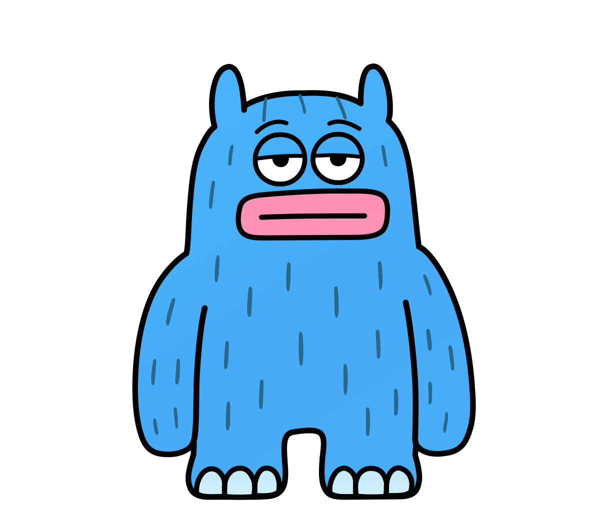 BlueBlinks and smiles
- BlueAvatar
- RedClean
- RedWith scarf
- RedSmile
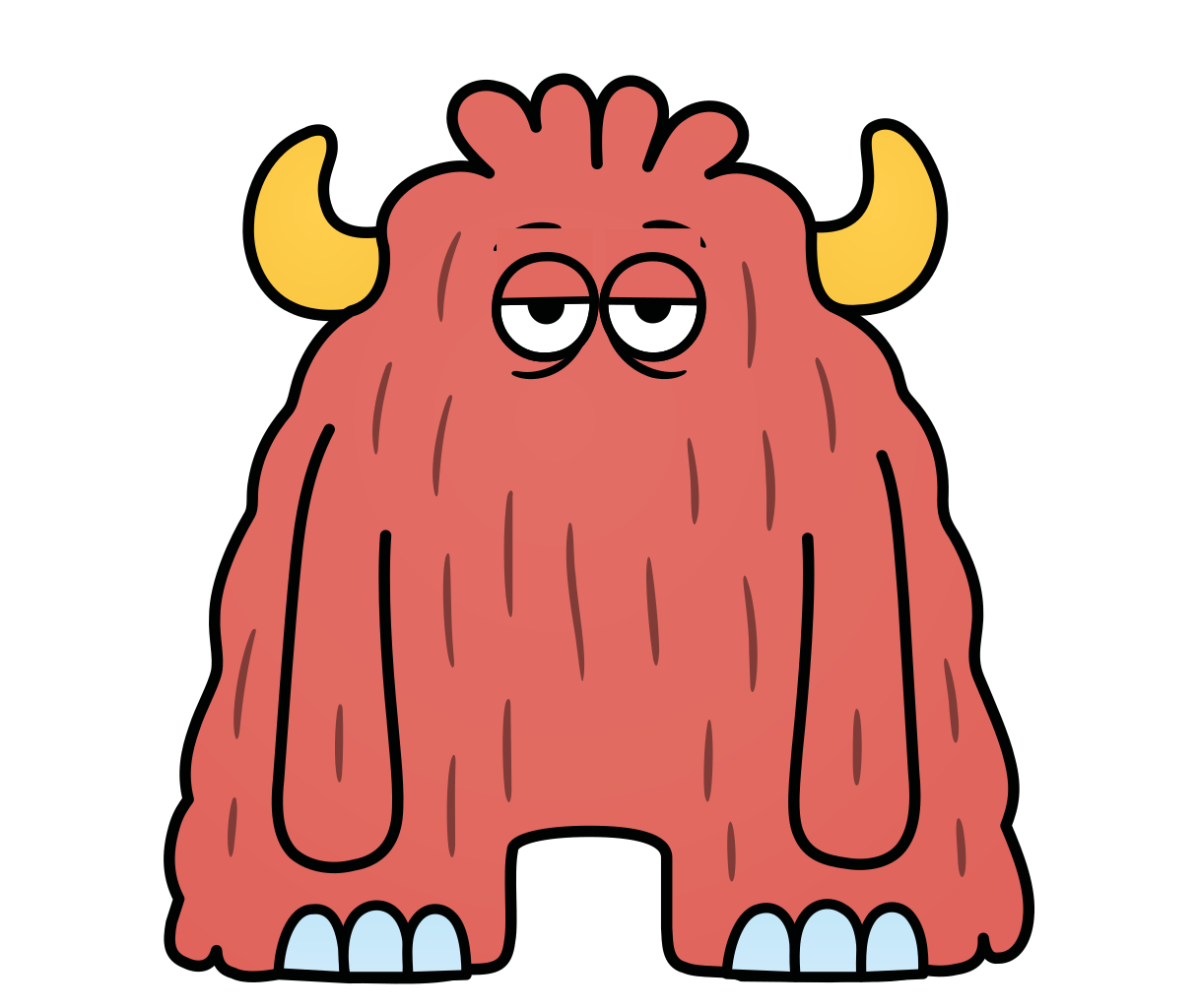 RedBlinks
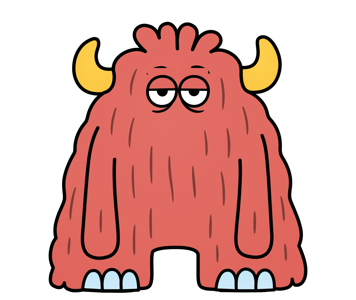 RedBlinks and smiles
- RedAvatar
- PurpleClean
- PurpleWith mug
- PurpleSmile
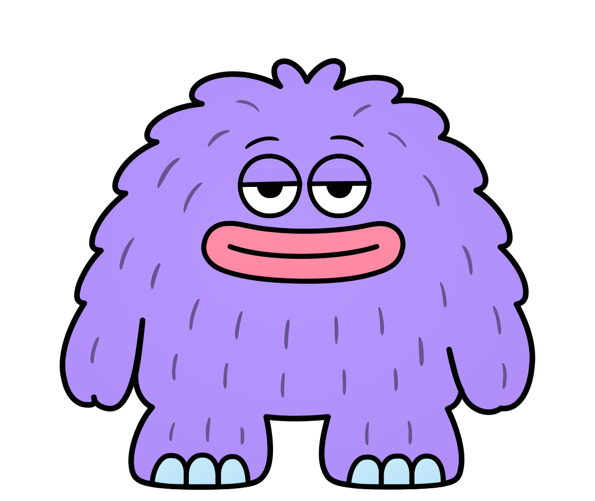 PurpleBlinks
 PurpleBlinks and smiles
- PurpleAvatar
- CreamClean
- CreamWith megaphone
- CreamSmile
 CreamBlinks
 CreamBlinks and smiles
- CreamAvatar
- GreenClean
- GreenWith clipboard
- GreenSmile
 GreenBlinks
 GreenBlinks and smiles
- GreenAvatar
- YellowClean
- YellowWith monocle
- YellowSmile
 YellowBlinks
 YellowBlinks and smiles
- YellowAvatar
Pattern

Slides
Fonts and icons
- GeistText. Free · vercel.com/font
- Geist MonoLabels. Free · vercel.com/font
- IconotekaIcons. Free, MIT licence · iconoteka.com
- ModulordNot shared here: the licence is to confirm. The logo files do not need the font.